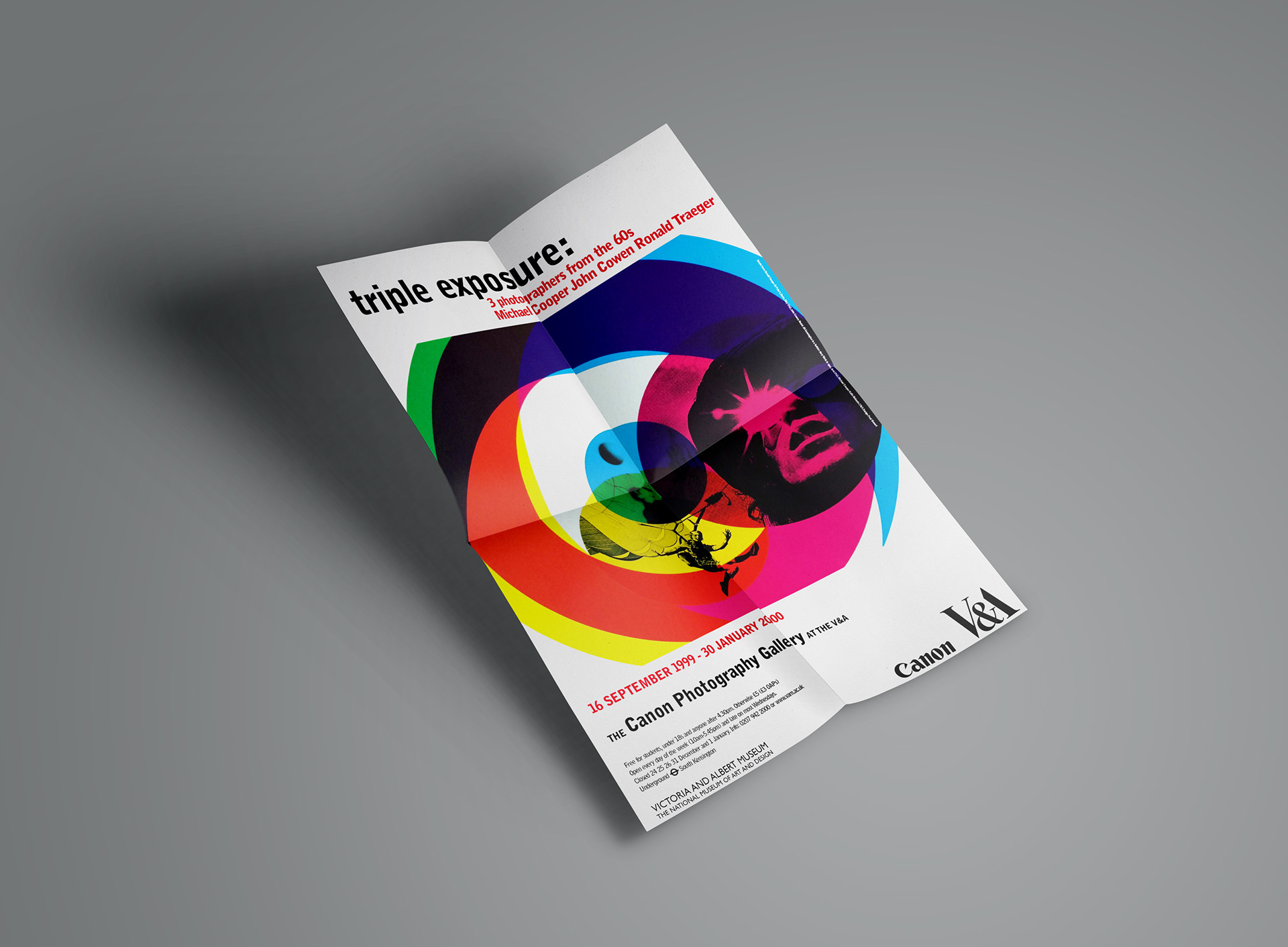
As this was an exhibition featuring three fashion/music photographers from the 1960s, I avoided focusing on just one of the photographers to represent the show. I devised a graphics solution by incorporating elements of each photographer's key images, creating three roundels (the 'triple' aspect) with photographs that contained circular elements, for example, the football, parachute and sunglasses, and overprinting them to evoke early UK 1960s graphics. Using the vivid CMYK colours on the target motifs linked the design appropriately to the new fashion, Pop Art and UK Mod movement of the period.
Using Bell Gothic as the primary typeface gave the typography a utilitarian feel and a bold print presence.
The design was applied across an extensive marketing campaign, including transport and outdoor advertising sites.
This work aligns with my creative and professional aims as it includes themes such as 1960s popular culture and social history within the arts and culture sector.
The boldness of the graphic forms, colours and typographic style is representative of my current design aesthetic.
Poster campaign
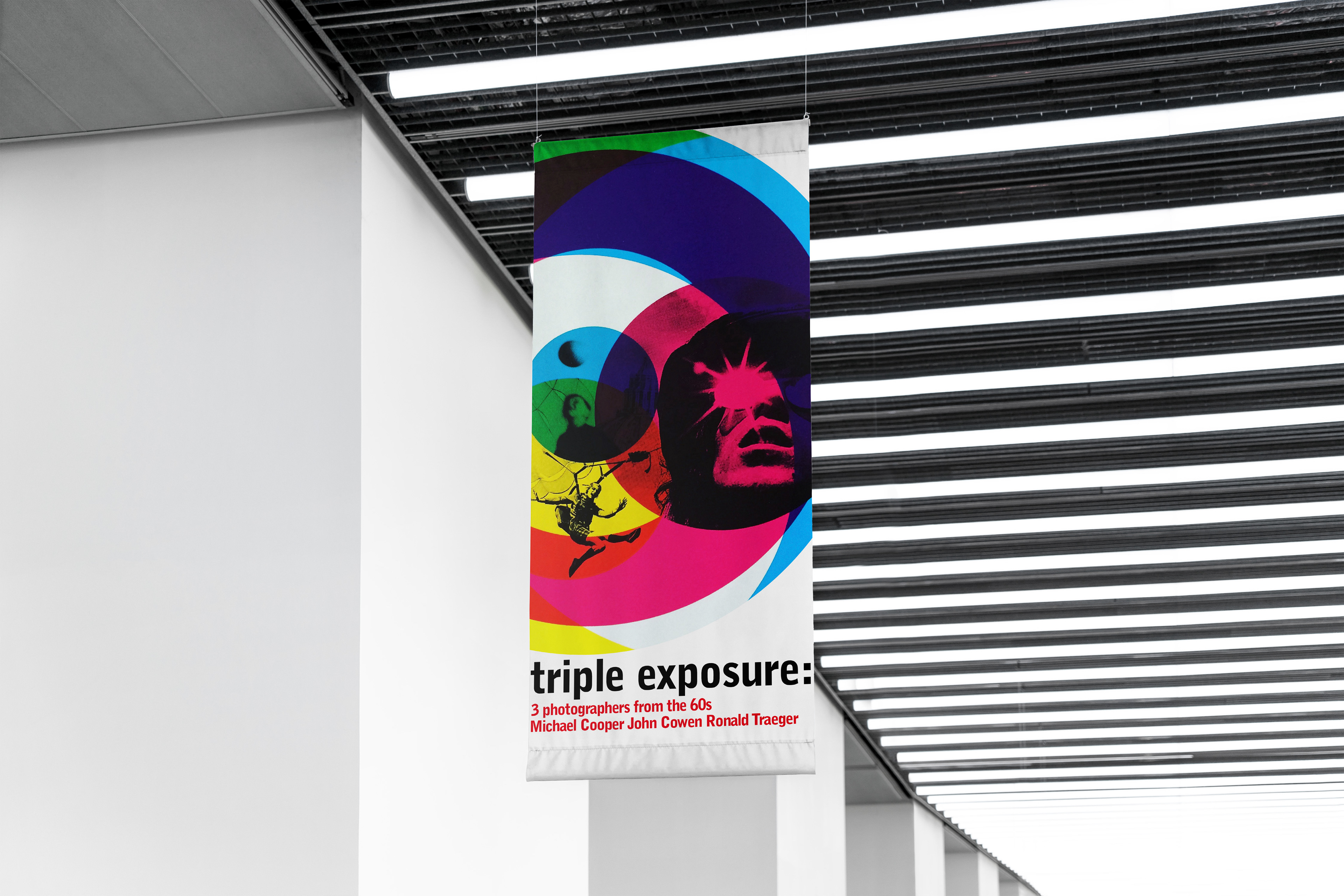
Exhibition banner
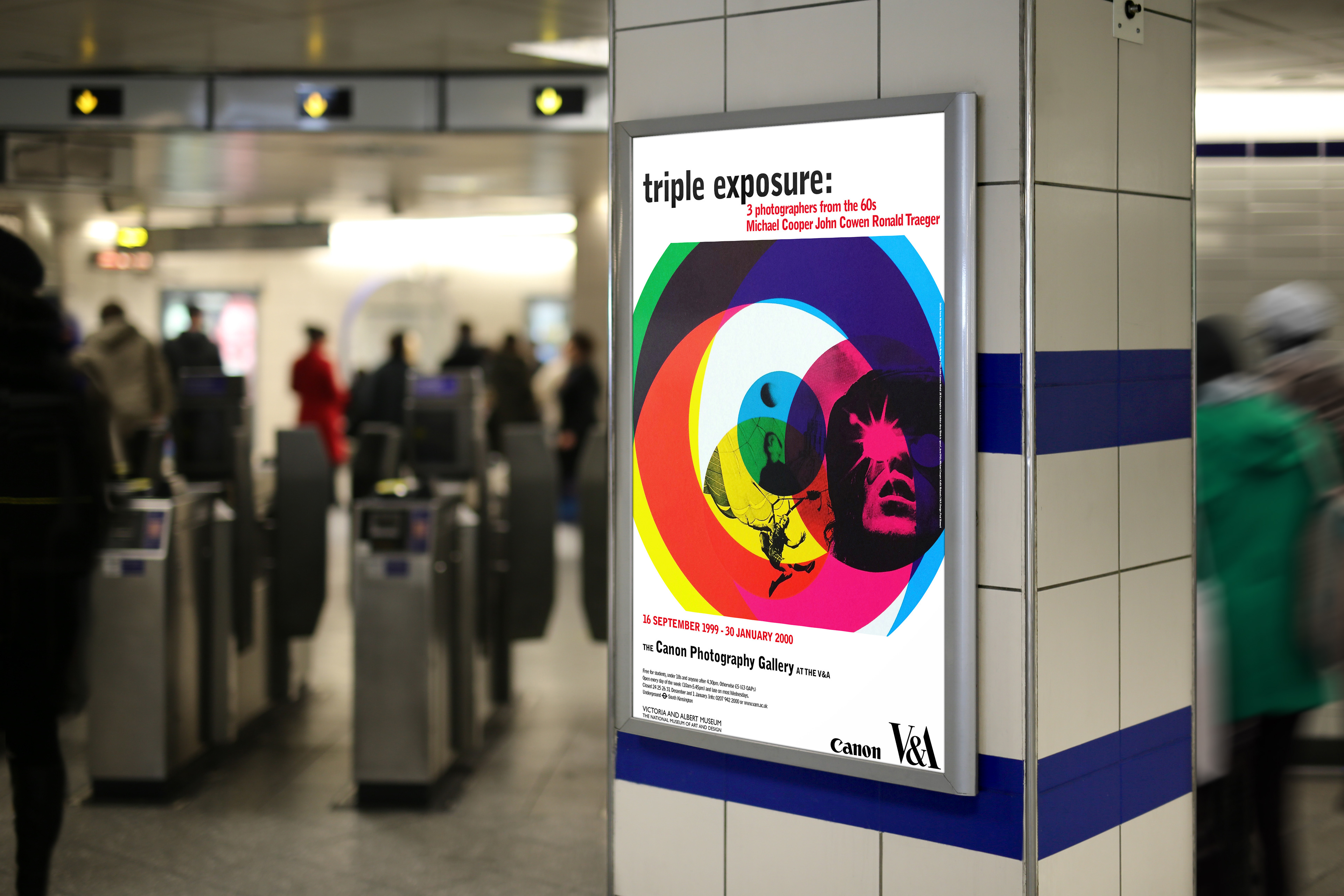
London Underground poster campaign
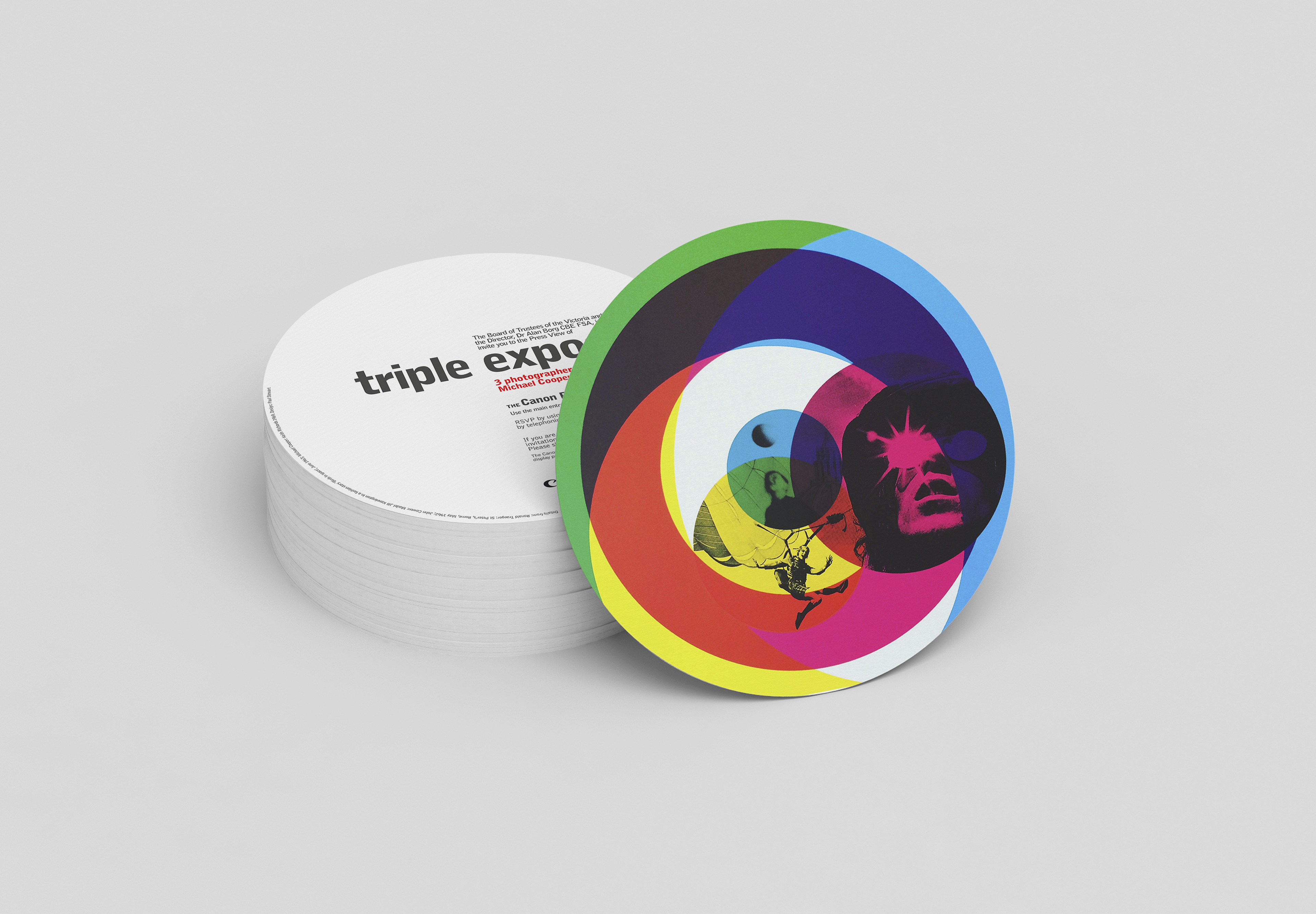
Press view invite
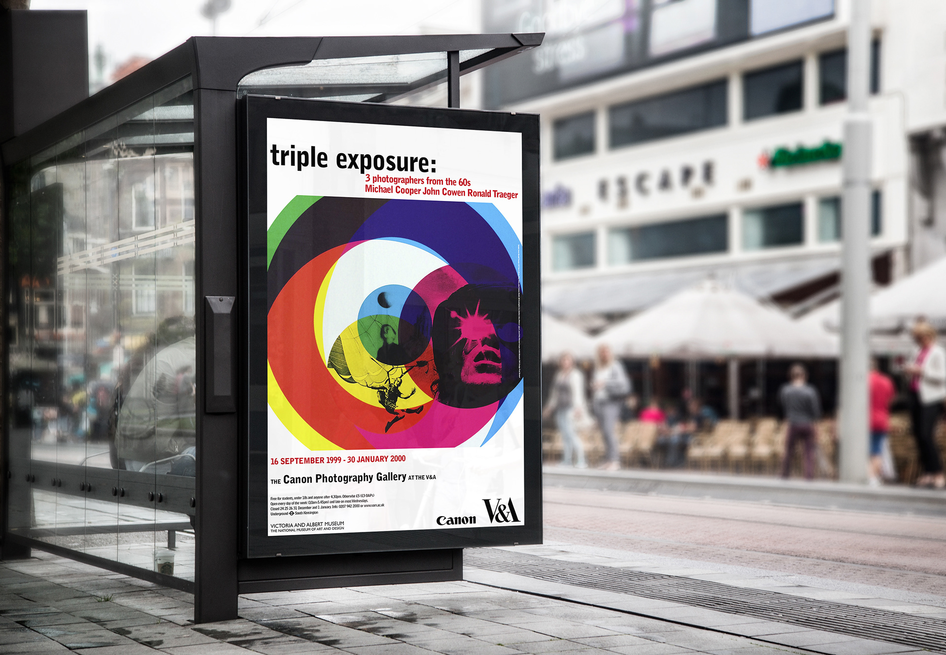
Outdoor advertising campaign