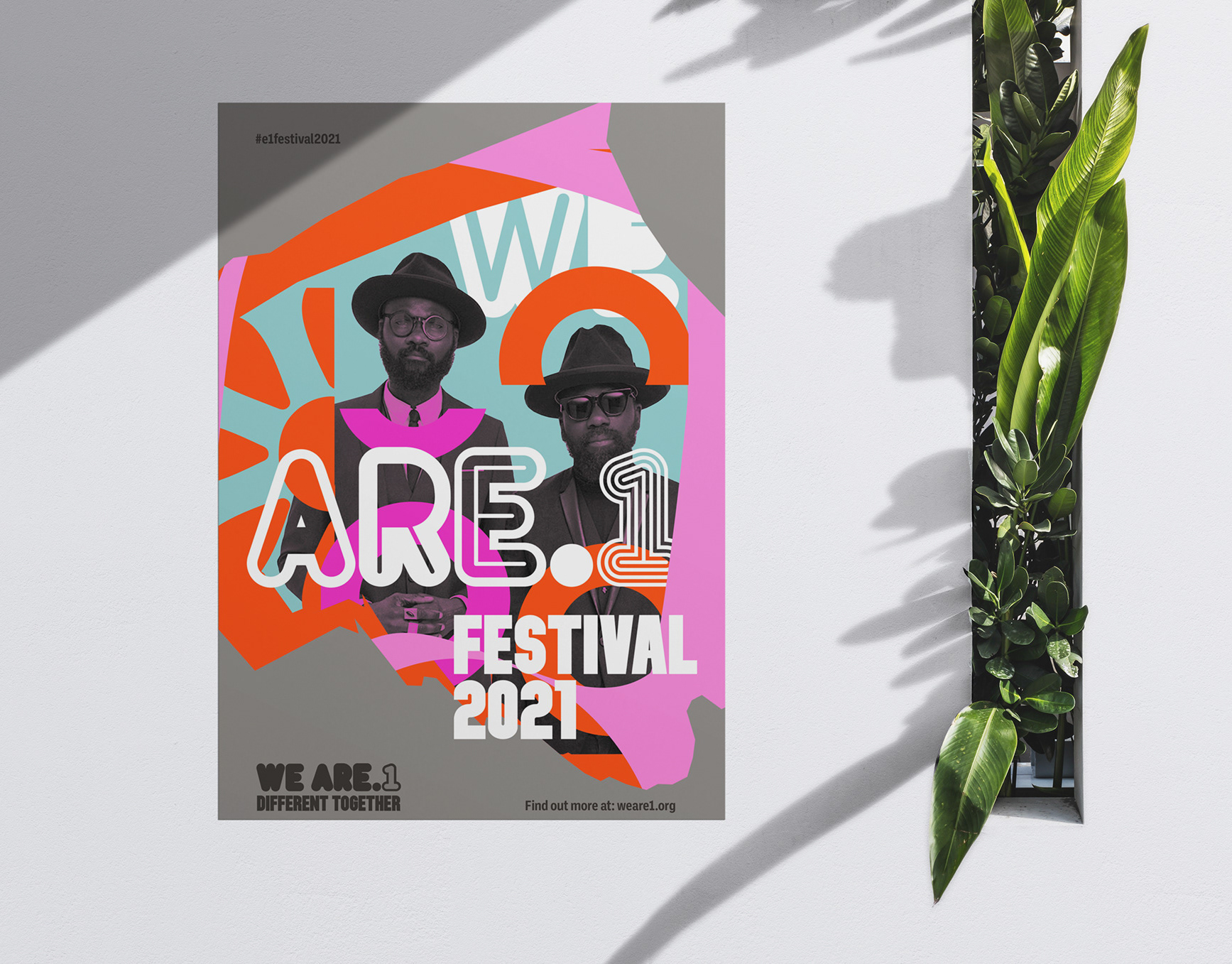
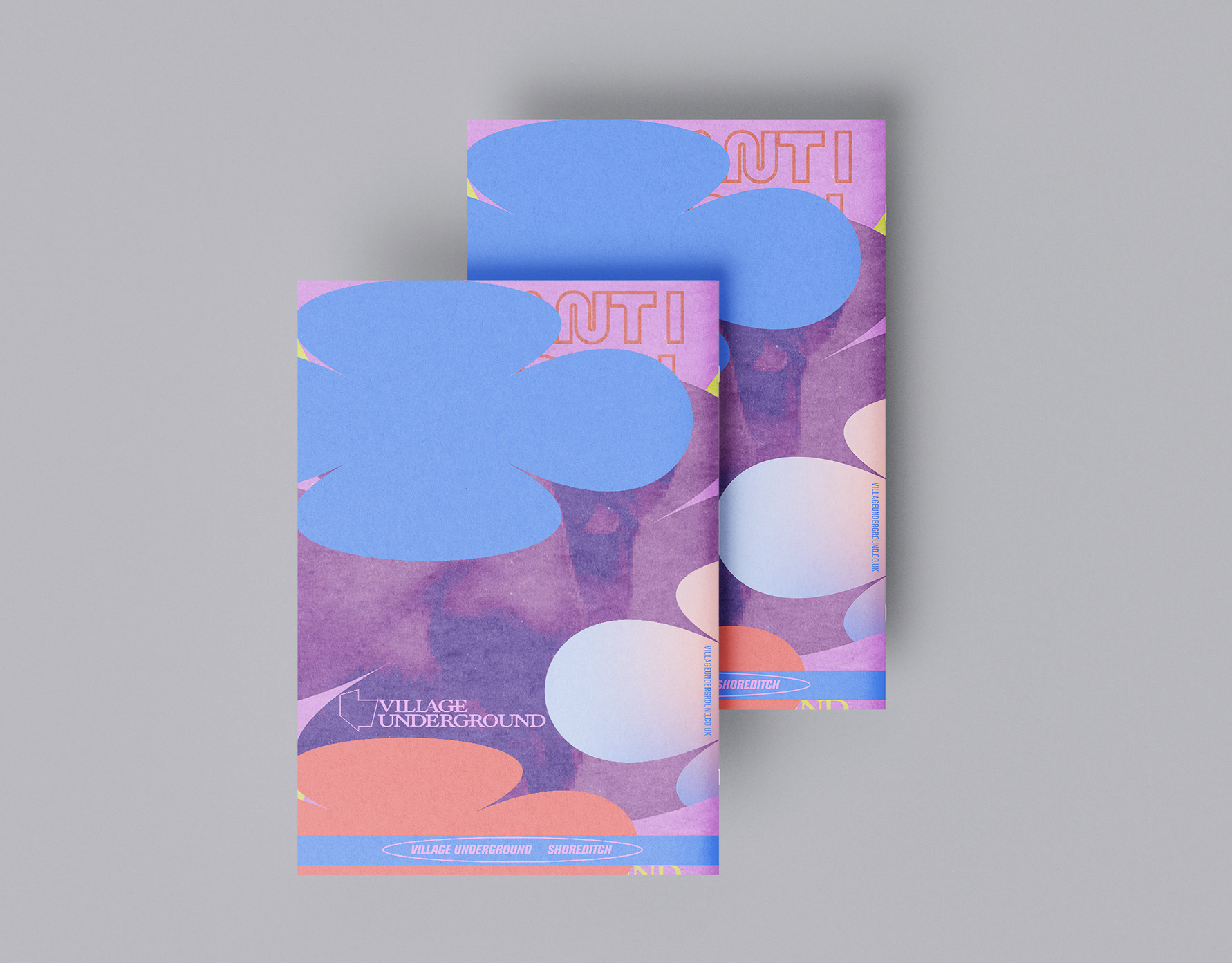
The symbol-based routes developed for Audience Evaluation research drew positive feedback, so was an appropriate area of visual exploration for the E1 place branding and links to my Critical Enquiry’s findings around the effectiveness of using urban vernacular references in communicating place elements.
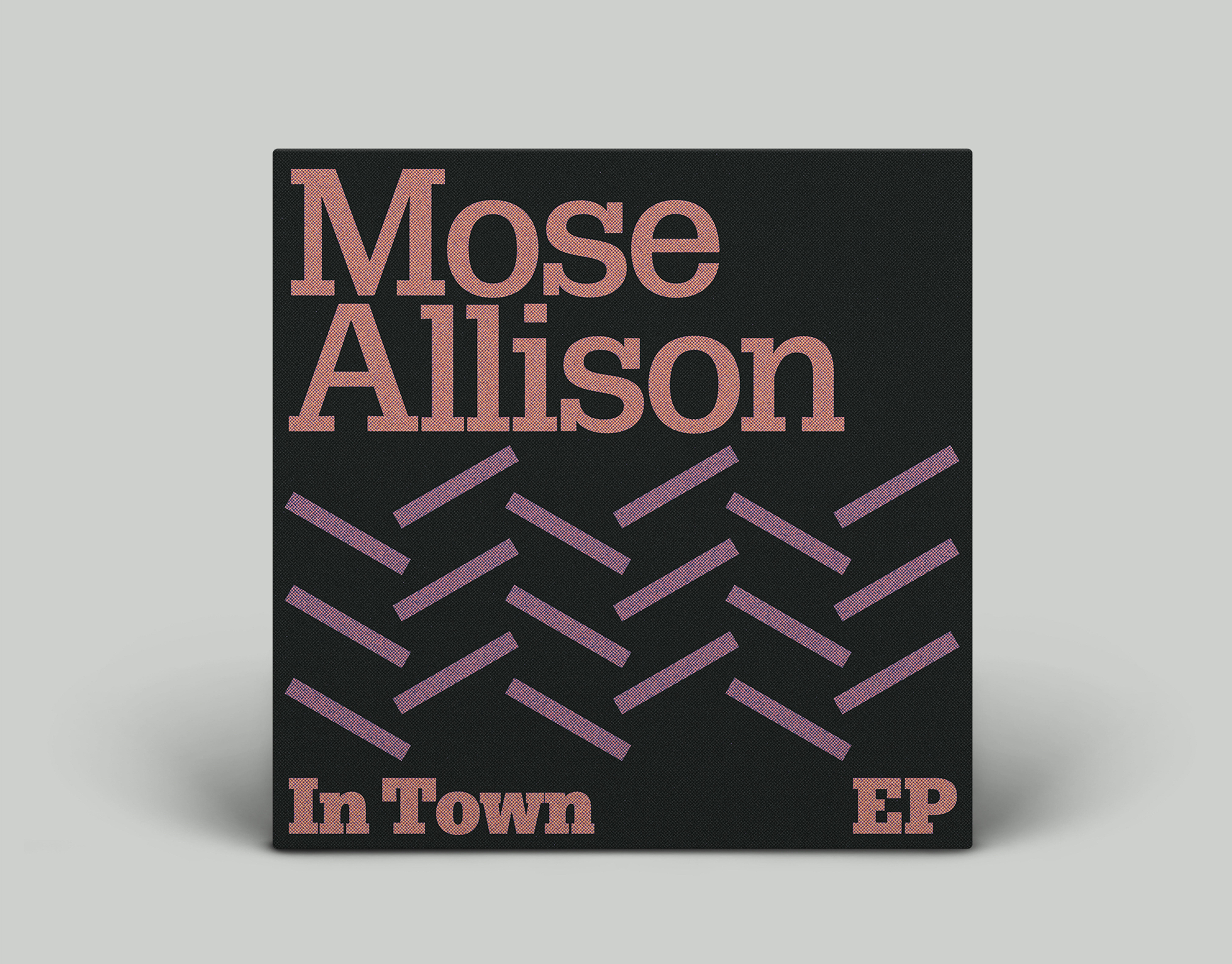
Based on an assortment of symbols and graphic forms found on utility and monuments in E1, though juxtaposition, repetition and cropping, they have been linked to communicate different themes of E1’s identity.
Some possess Huguenot weavers characteristics including the spools of fabrics and silk patterns but also all the textile-based activities of subsequent immigrant communities in E1 including Irish weavers in 18th century, Jewish tailors from the late 19th century and Bengali saree and leatherwear manufacturers from the 1960s onwards.
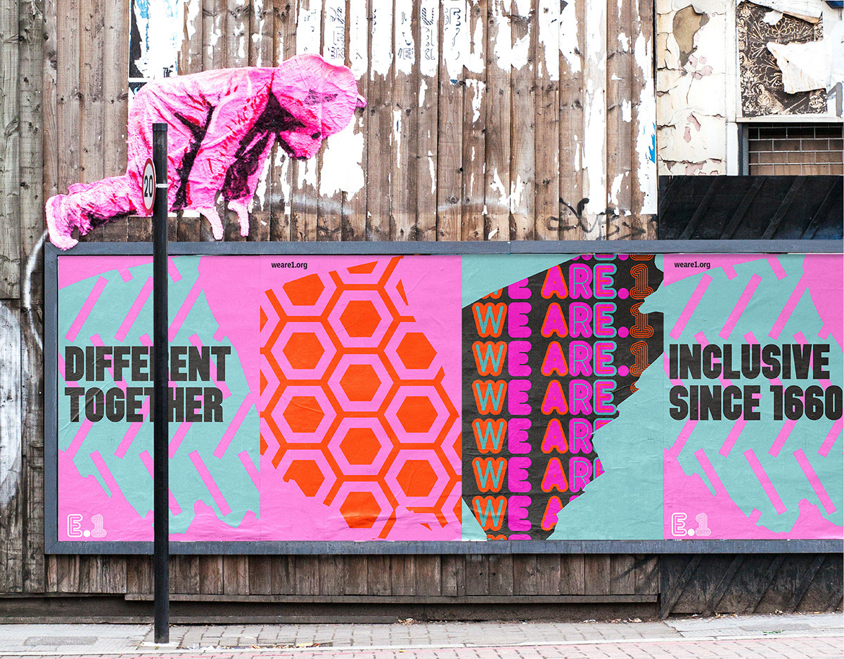
The graphic forms can be used to communicate urban and social themes of street life and culture when colour is applied or when used with specific texts and imagery. The symbols communicate an urban image of E1 that is vibrant, busy and kinetic that is reflective of place. By avoiding the usage of actual cultural symbols, the work avoids the pitfalls of place branding that is criticised for cultural appropriation or cultural exclusion and allows for broader audience engagement with the branding.
Poster in situ around Brick Lane, the location of the E1 place brand launch.
