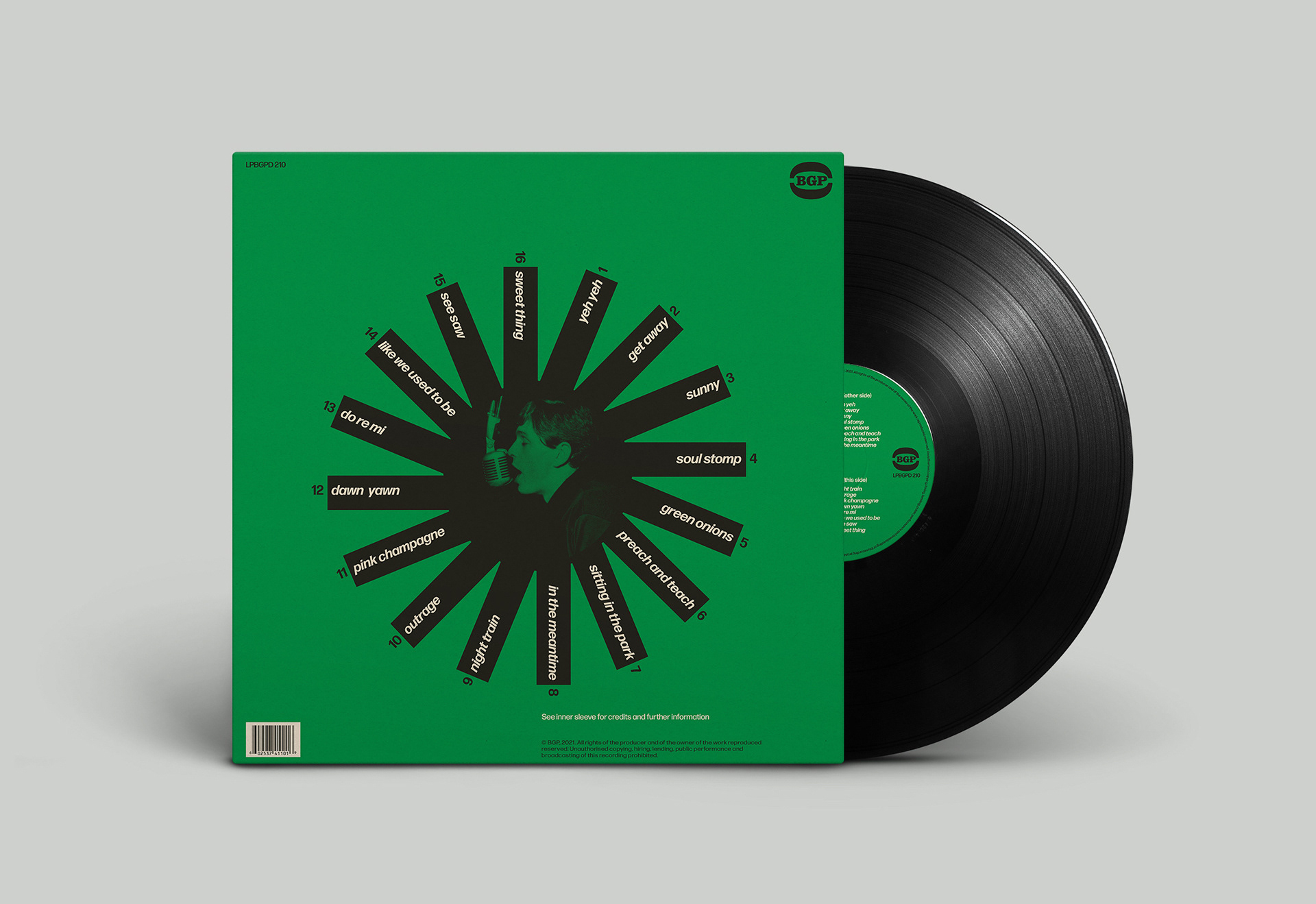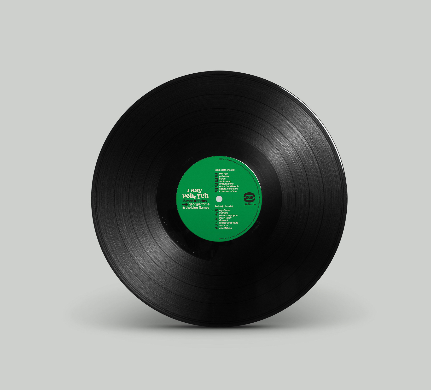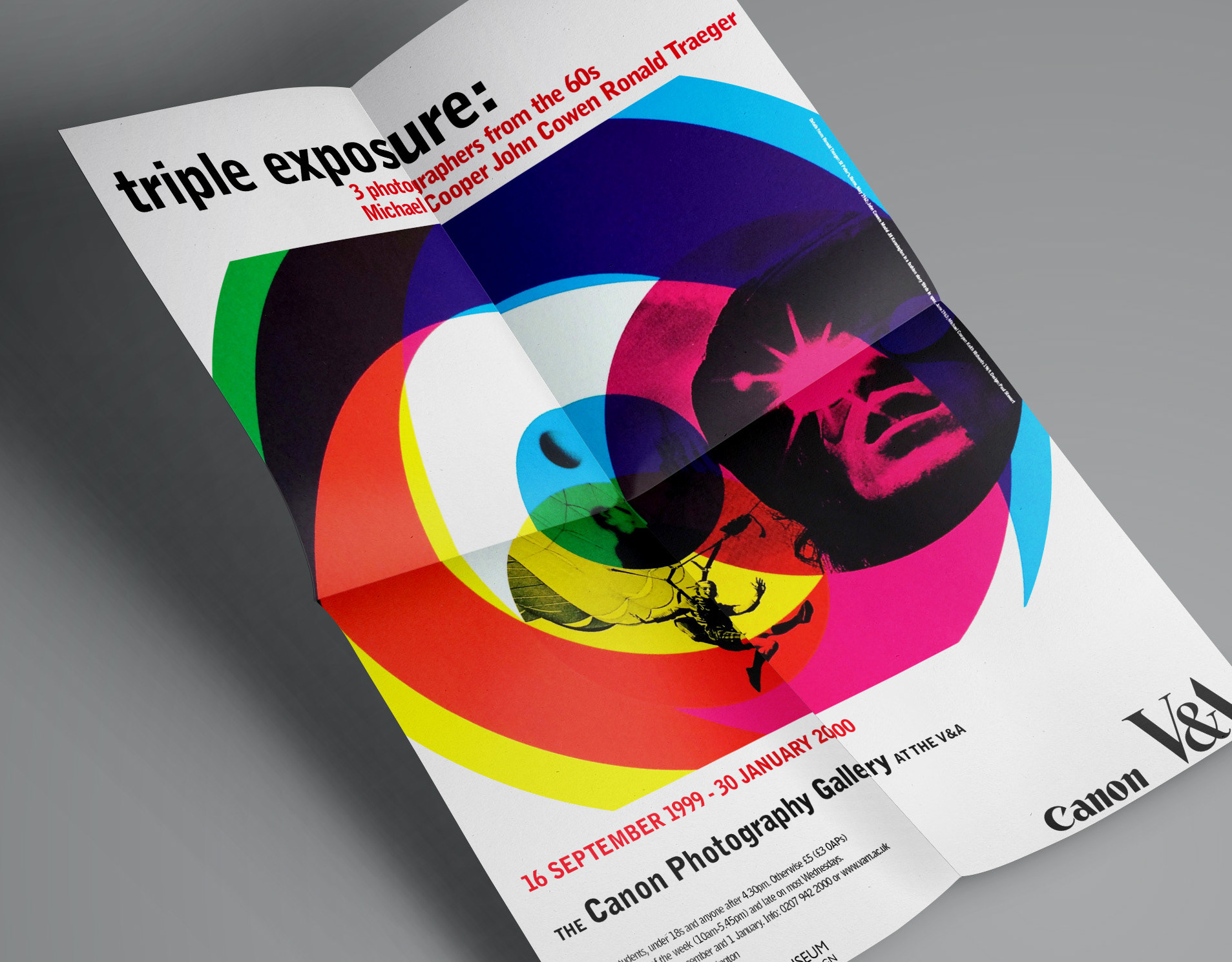
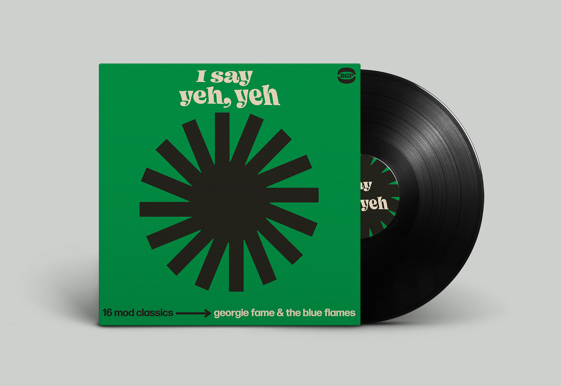
The tracklist provides a snapshot of London Soho nightlife in the early to mid-1960s.
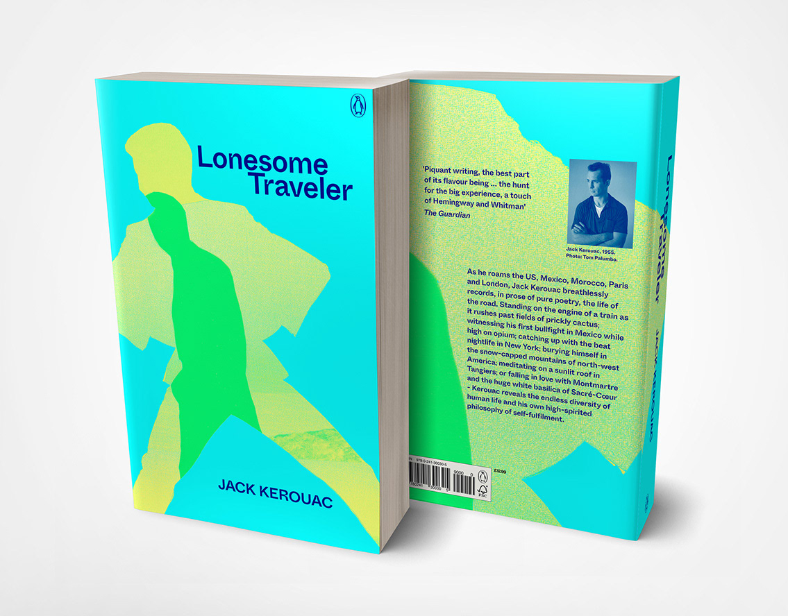
The visual language helps communicate a specific mood of an era. It comprises imagined and remembered fragments of UK pop culture. It distils them into forms that develop an emotional and evocative typographic and design approach that helps communicate the music and atmosphere of a specific time, yet it manages to look contemporary.
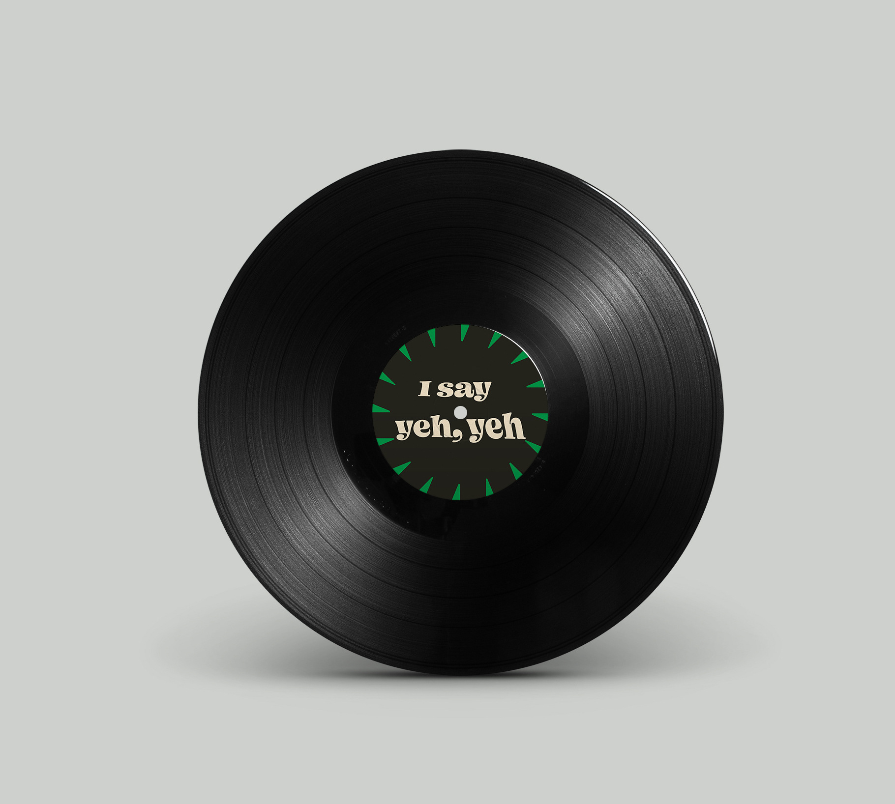
The title lettering is inspired by the jaunty individualistic typeface examples found on the picture sleeves of 1960s vinyl 45rpm single records.
The simplified elements provide an impactful graphic aesthetic.
The outcome communicates a joyful, optimistic and energetic sleeve design that reflects the contents of the record.