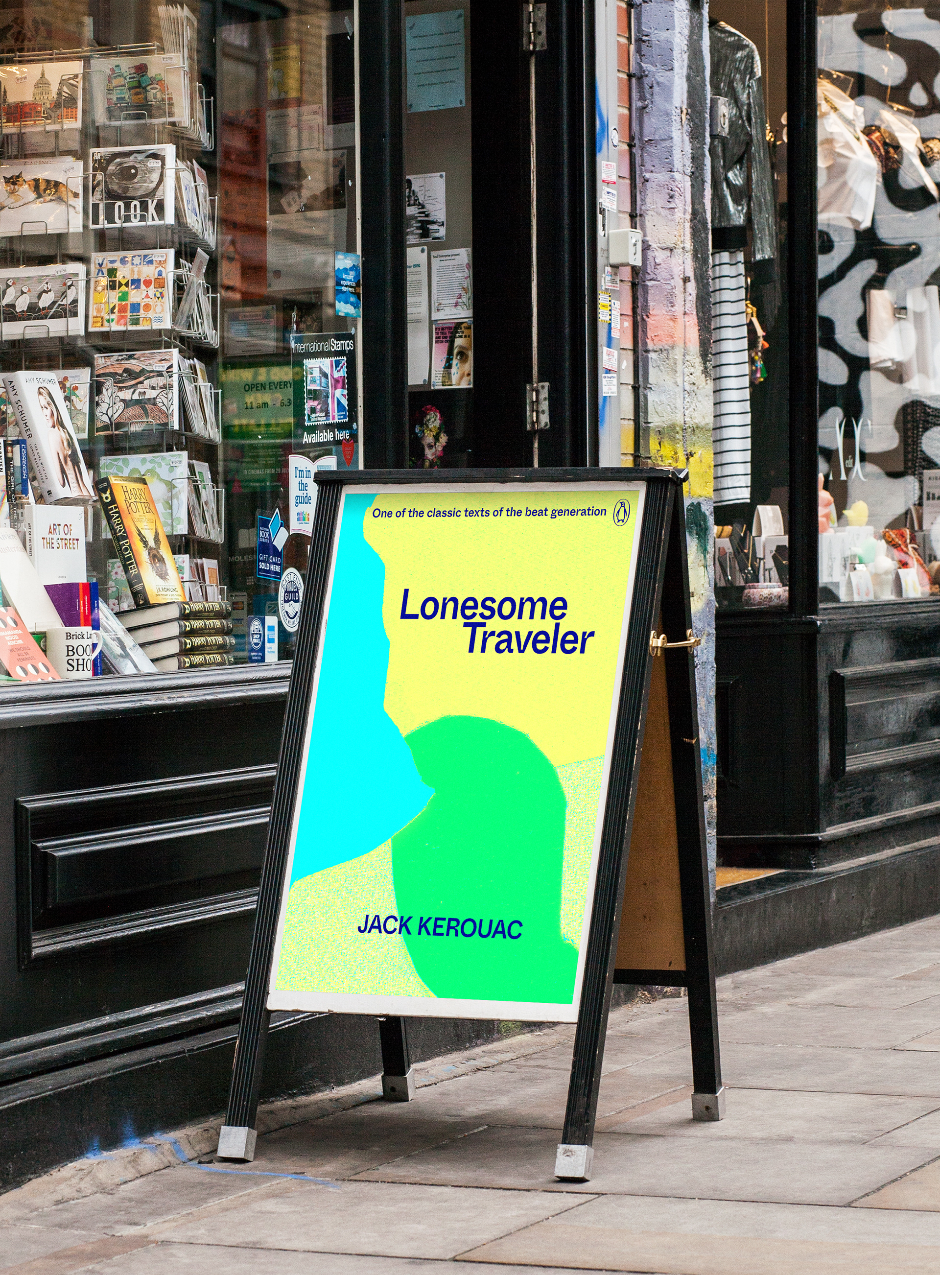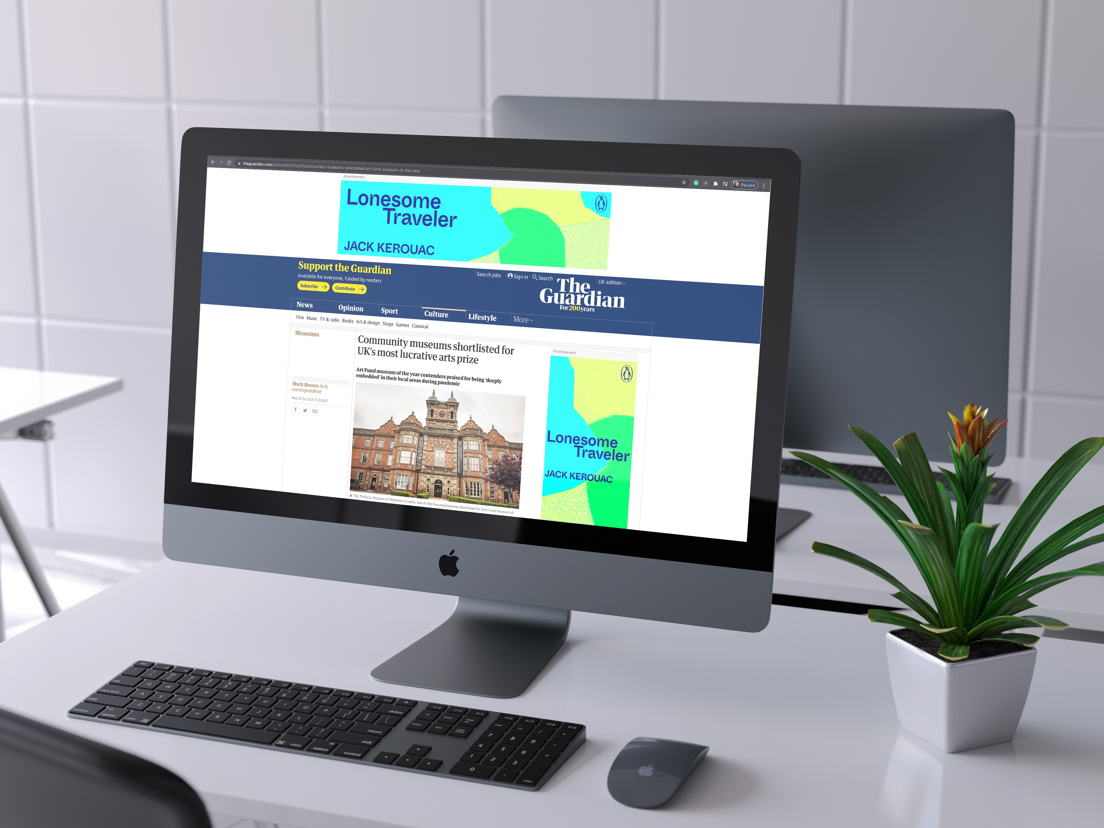
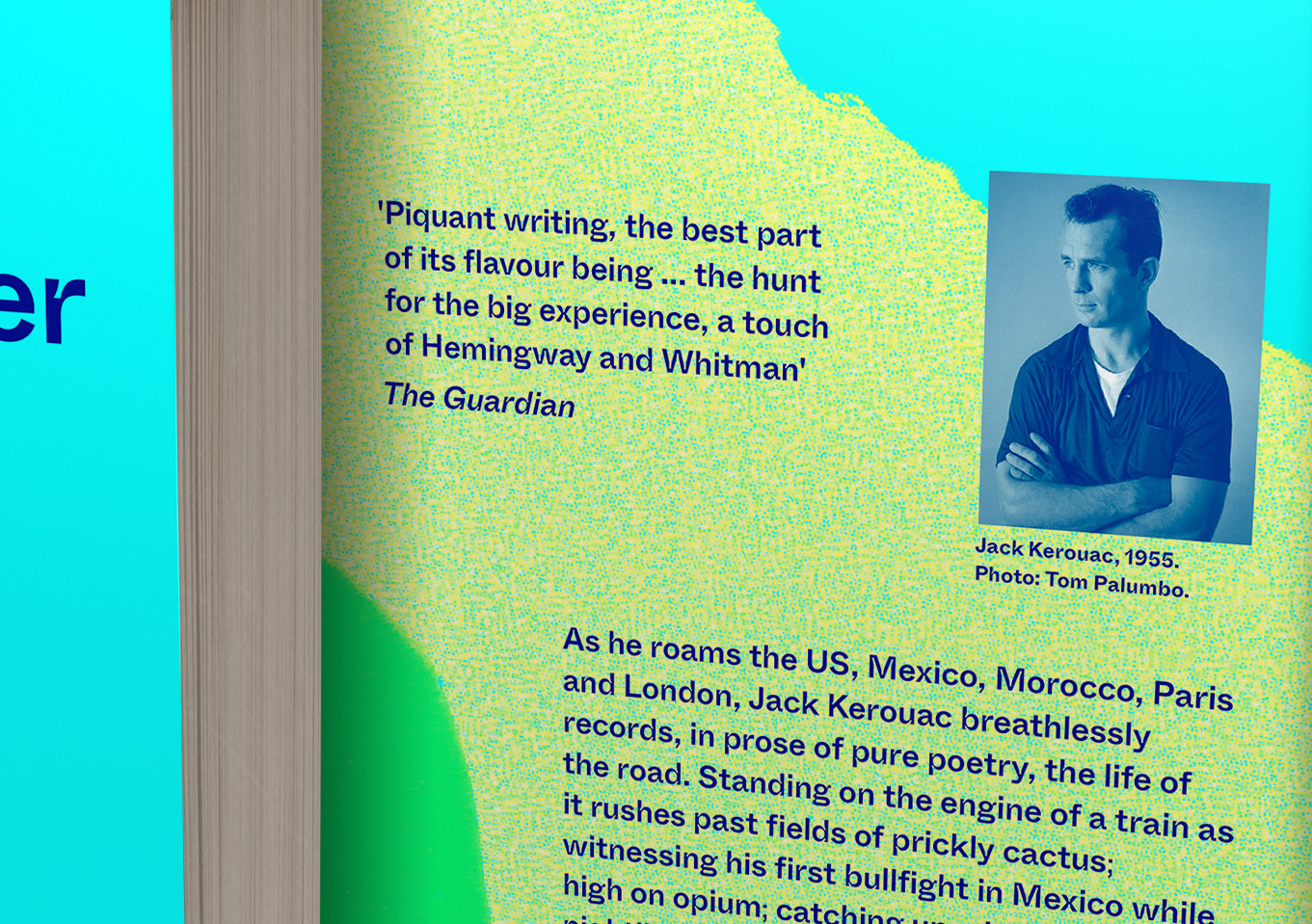
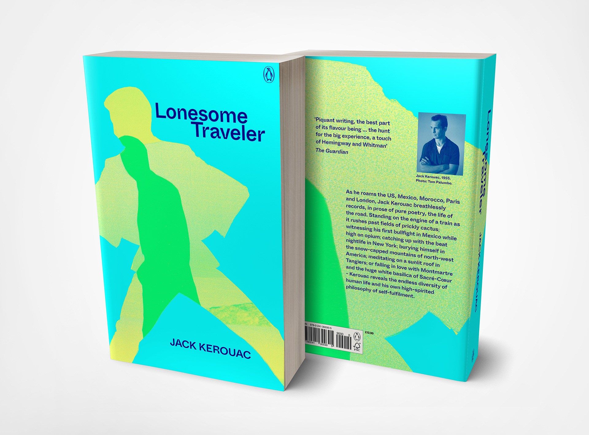
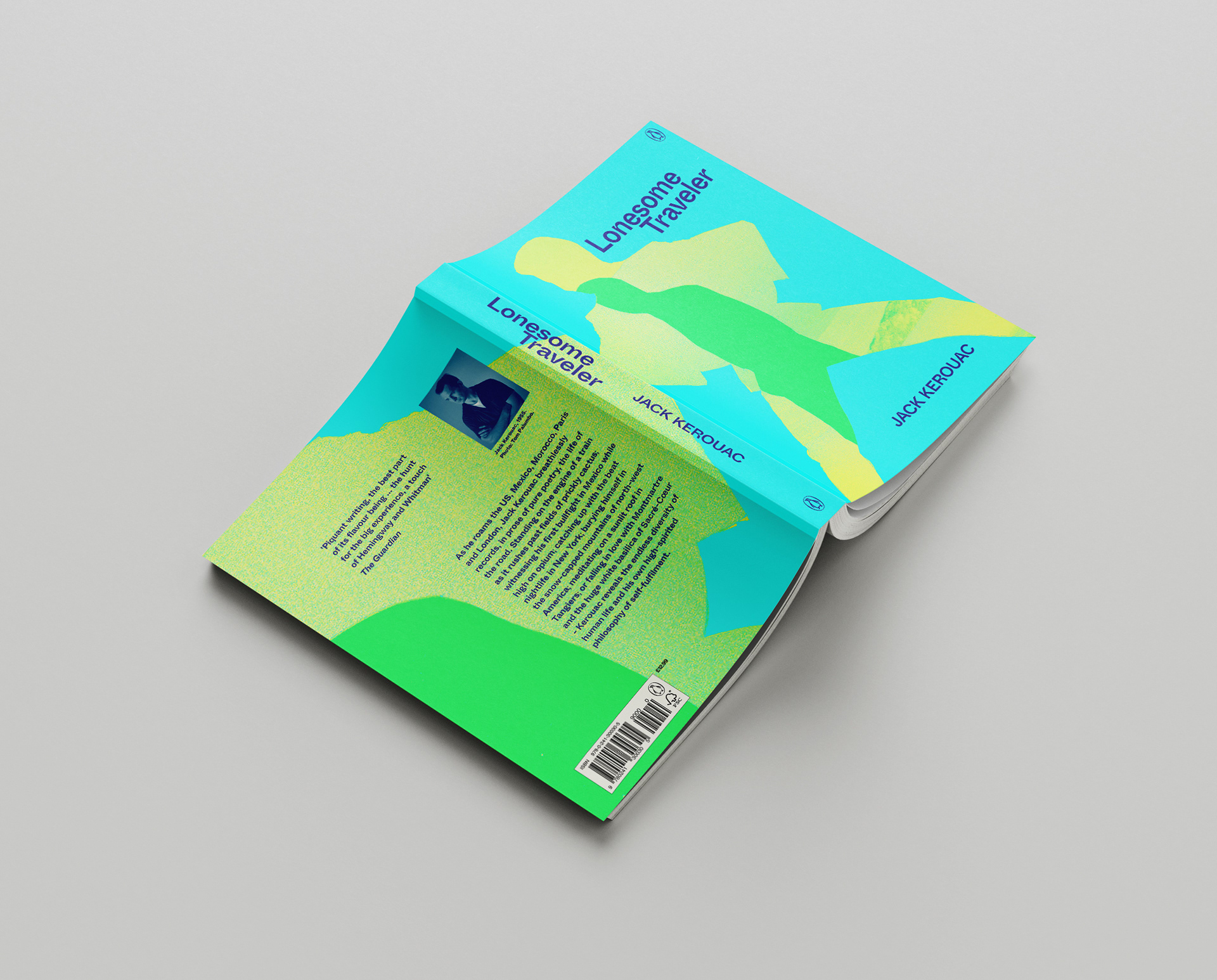
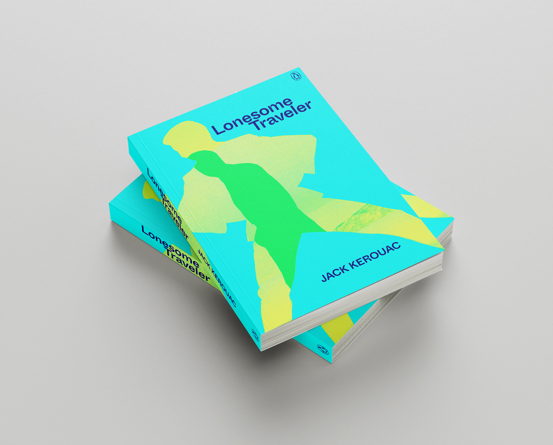
The book design is a reissue of a classic text of the beat generation, Lonesome Traveler (sic), first published in 1960. The publishing intention is to reposition the book towards new audiences. The design objectives are to distil the energy and adventure of Kerouac's prose style as he documents his travels in the US, Mexico, Morocco, Paris, and London into a vibrant and evocative visual language.
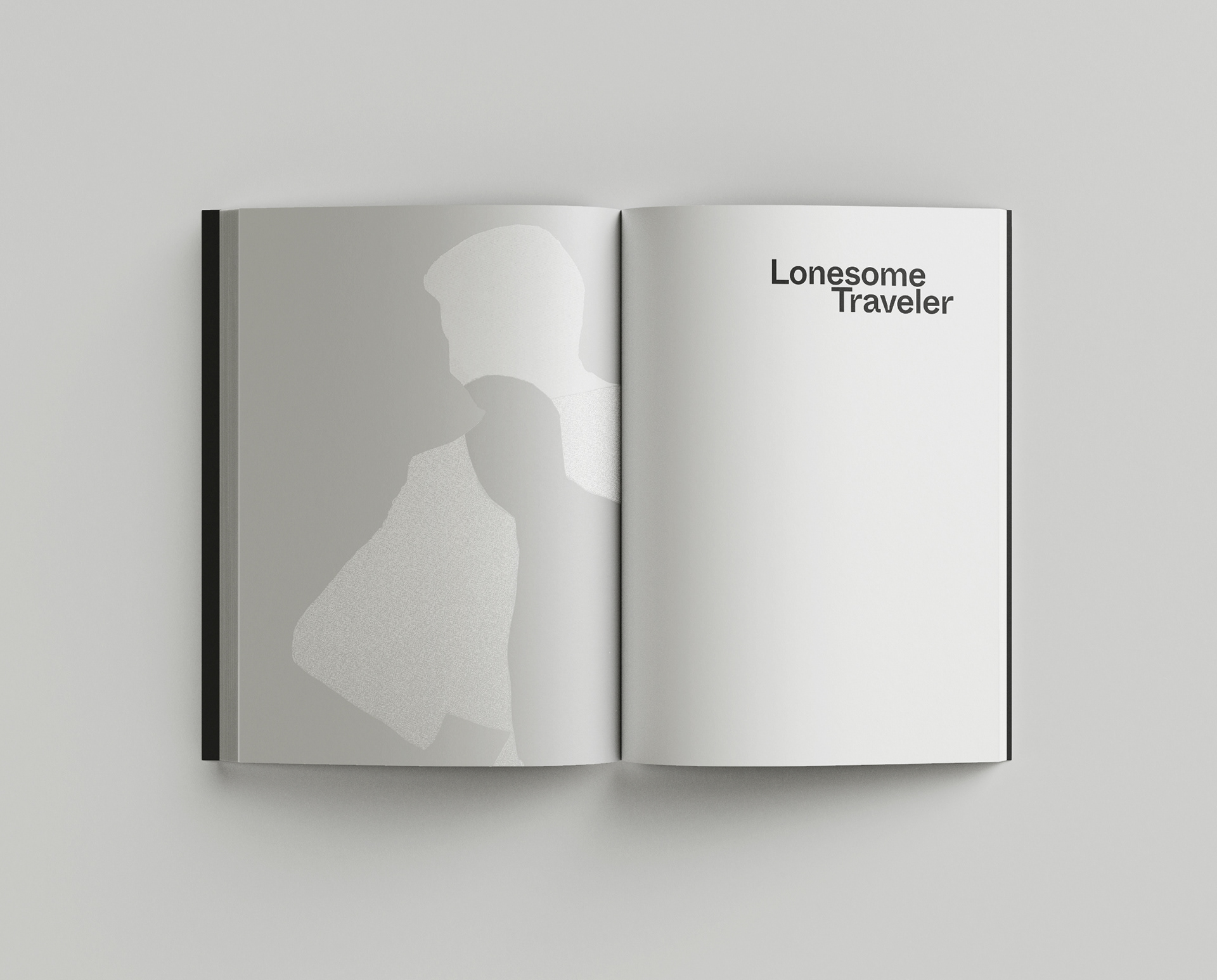
The graphic portrays the lone figure of the book's title both as an outward-looking adventurer and the internal figure suggesting the psychological effects and self-development during the travel experience.
These two motifs suggest a spiritual depth running alongside the pleasures and travails of life on the road. The figurative forms are also suggesting abstract maps with colours signifying land, sea and sand.
These two motifs suggest a spiritual depth running alongside the pleasures and travails of life on the road. The figurative forms are also suggesting abstract maps with colours signifying land, sea and sand.
The primary typeface has an inktrap design feature that infers print media, such as the infamous typescript manuscripts that Kerouac produced on long paper rolls.
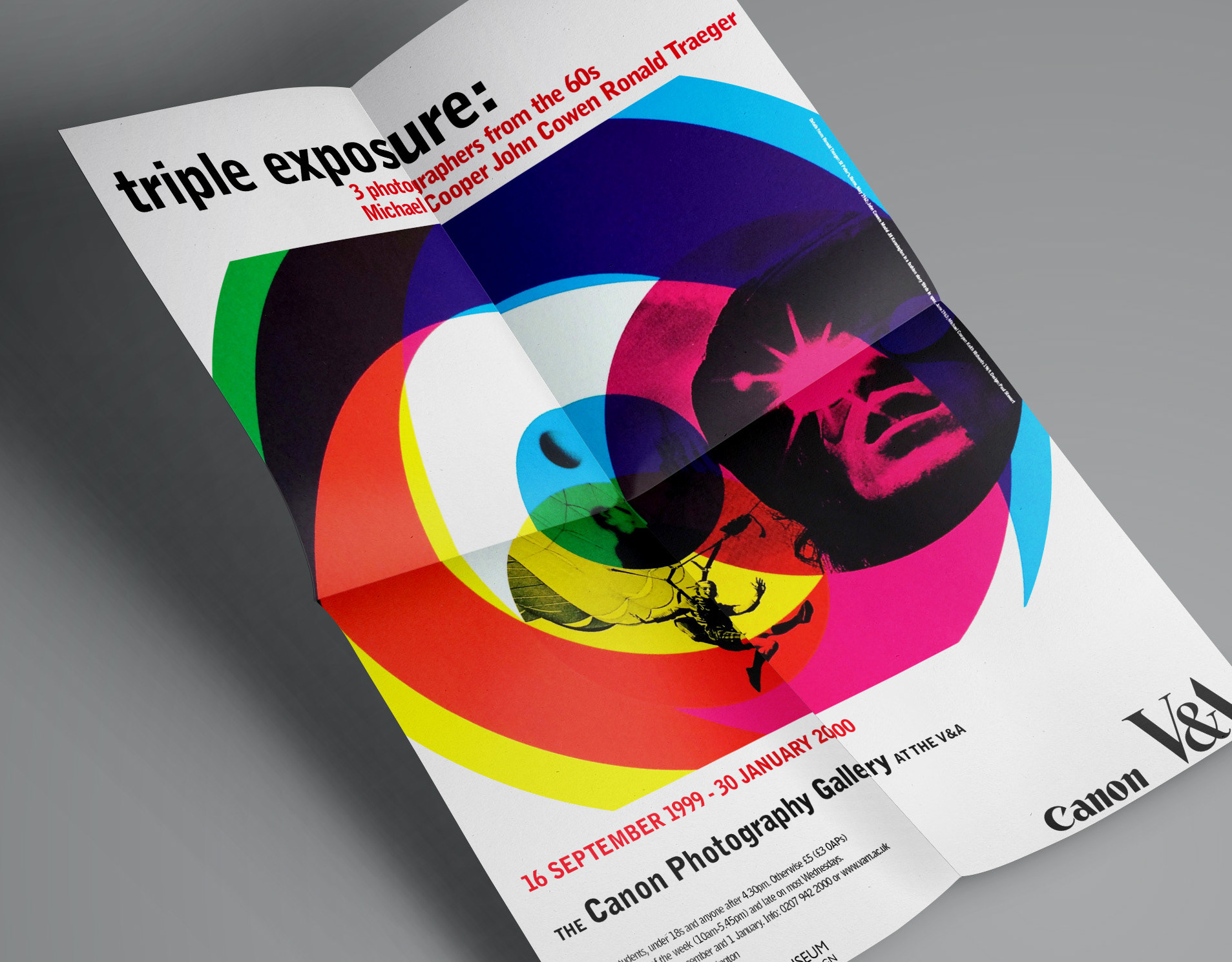
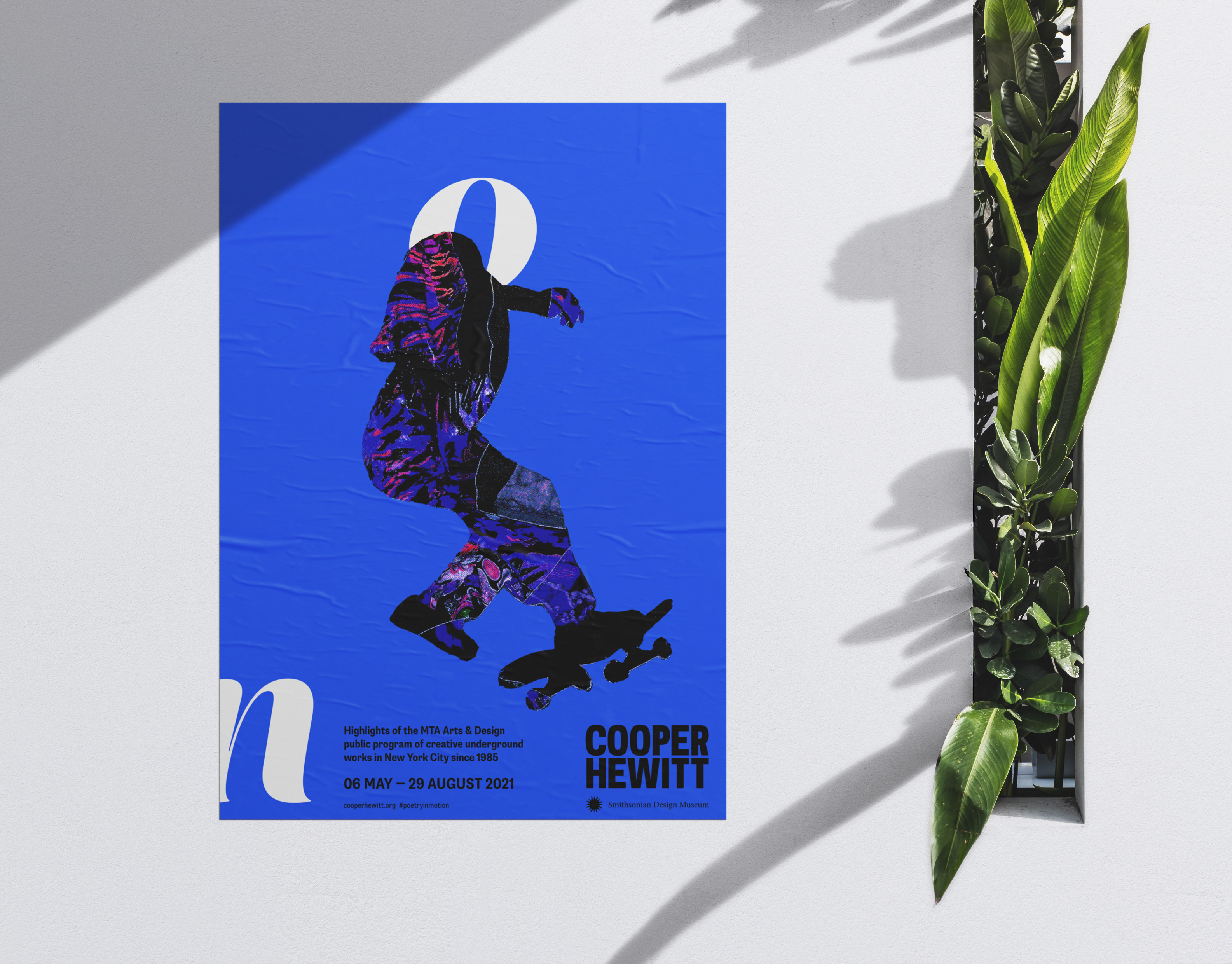
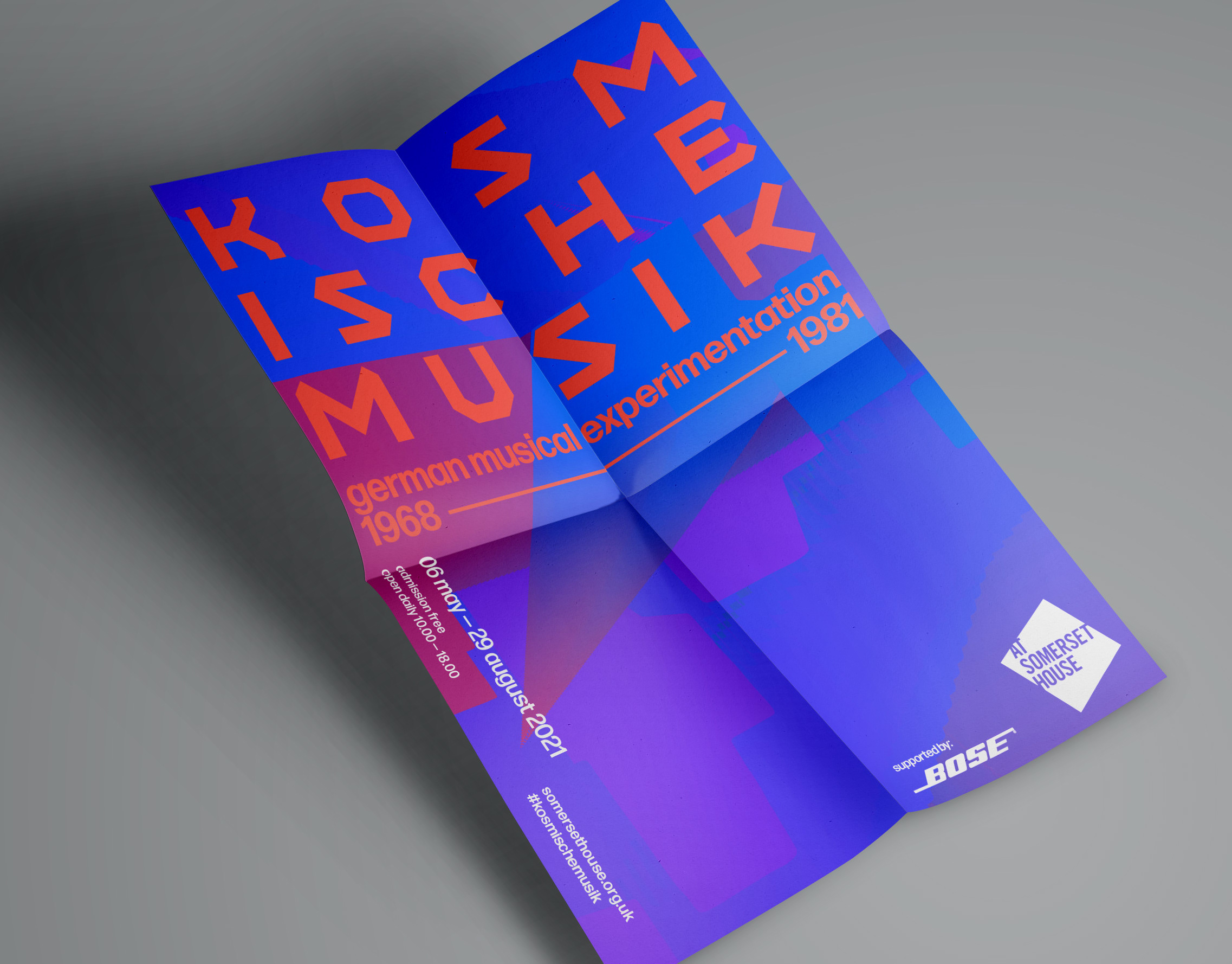
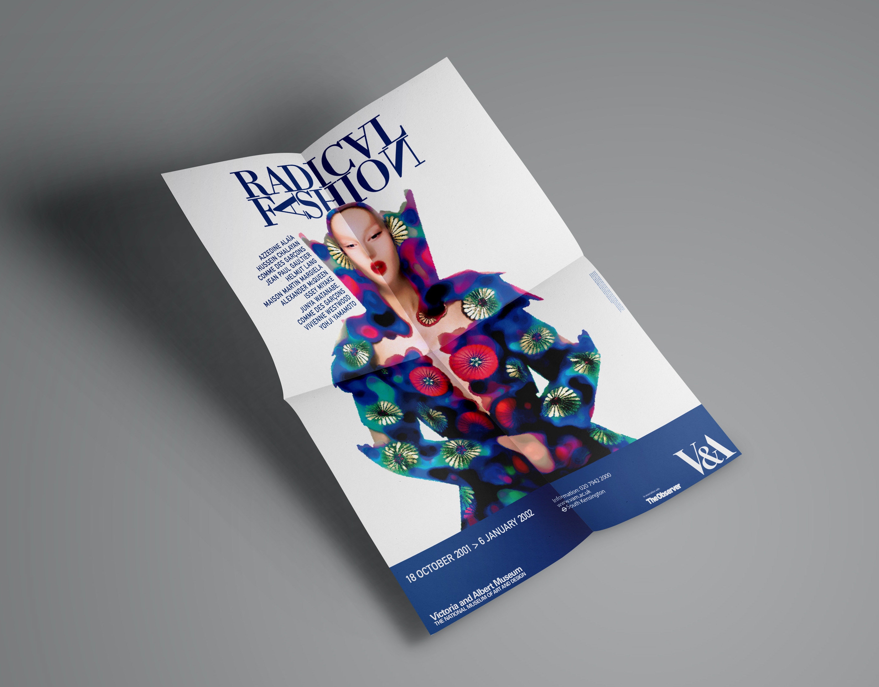
OOH advertising with graphic variation