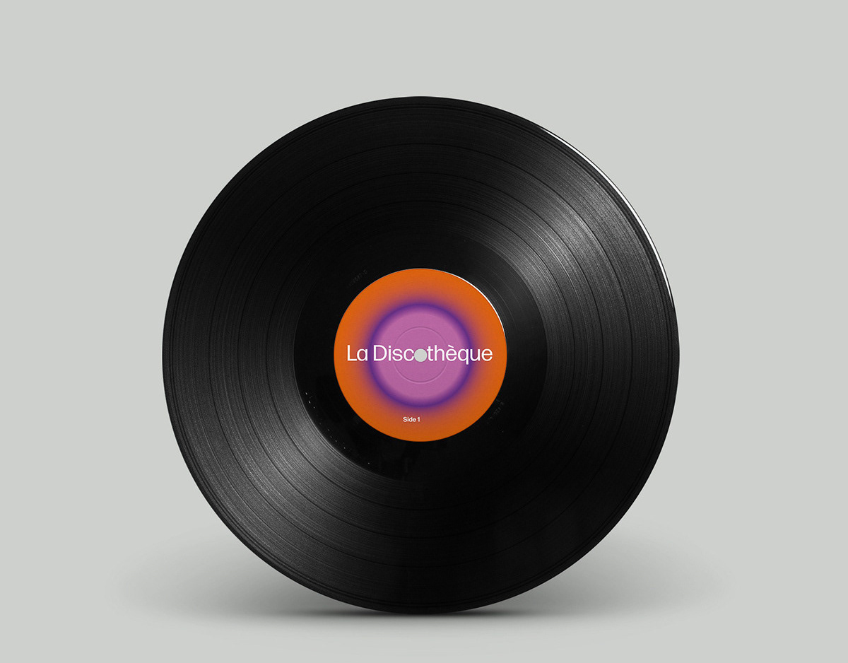
The design is for a special limited edition release for Record Store Day 2024. It is an EP bringing dancefloor-friendly tracks by the legendary jazz pianist Mose Allison, taken from the artist's classic period of the 1960s to new audiences. It will be released as a 12-inch vinyl, CD and available for digital download and streaming.
The cover concept explores the depiction of motion in still imagery to capture the very spirit of the city at night with the energy and excitement of jazz clubs and dancers and a 1960s graphic modernism fused with a US cool jazz sensibility.
The graphic forms and textured reproduction appearance reference the analogue design and print aesthetic of original vinyl record picture sleeves, club posters and flyers. The minimalist angular blocks evoke a sense of musicality and movement that lean into pop art elements prominent in visual culture during the timeline of the featured tracks.
The colour palette provides a muted nighttime sophistication for a visual language that evokes the period yet has contemporary appeal. The primary typeface is an Italian slab serif with a secondary sans face that is a sister font, both introduced during the original release period of the tracks featured on the record.
The work is an example of our design practice dedicated to crafting visual languages that resonate deeply, capturing the heart and soul of the concept being communicated within a timeless and accessible visual narrative.
