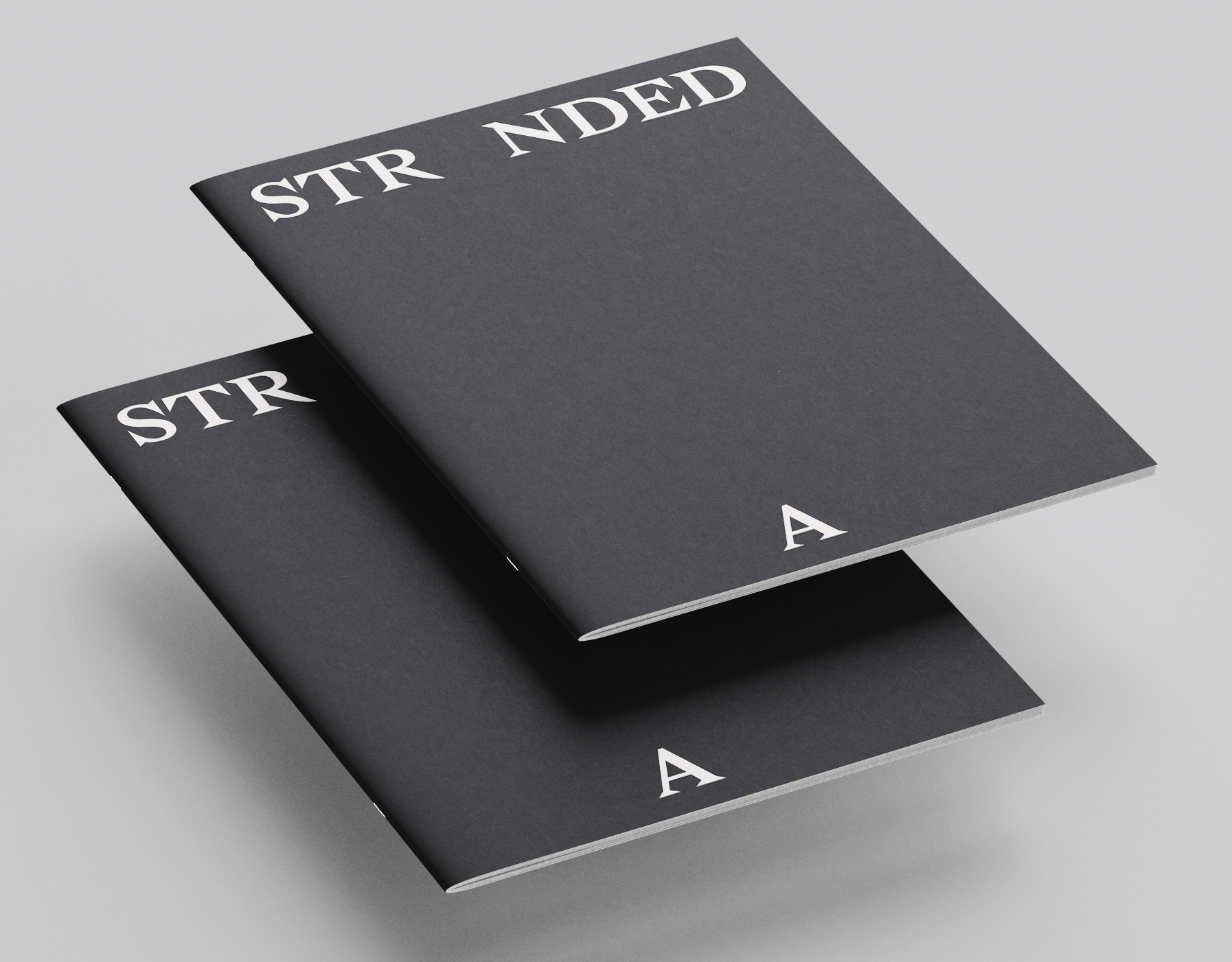
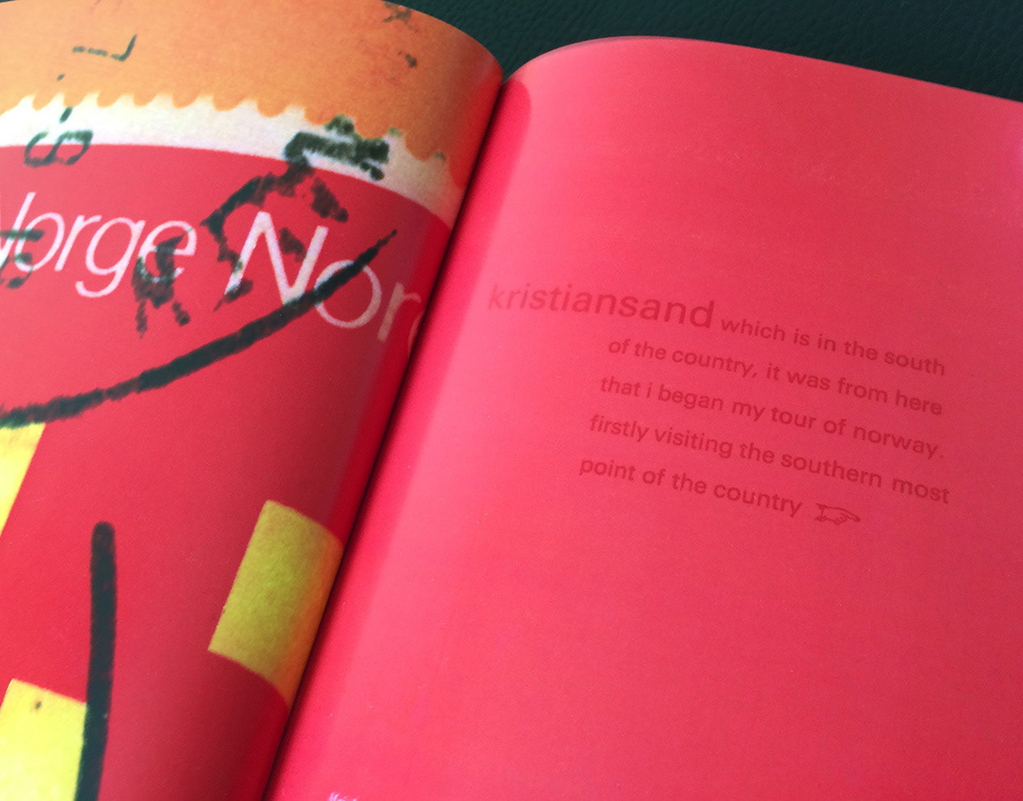
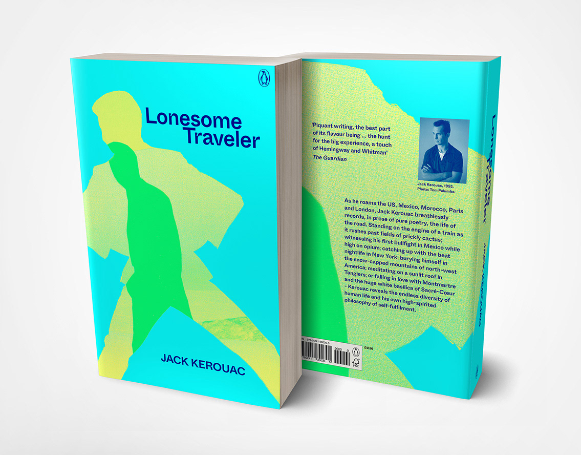
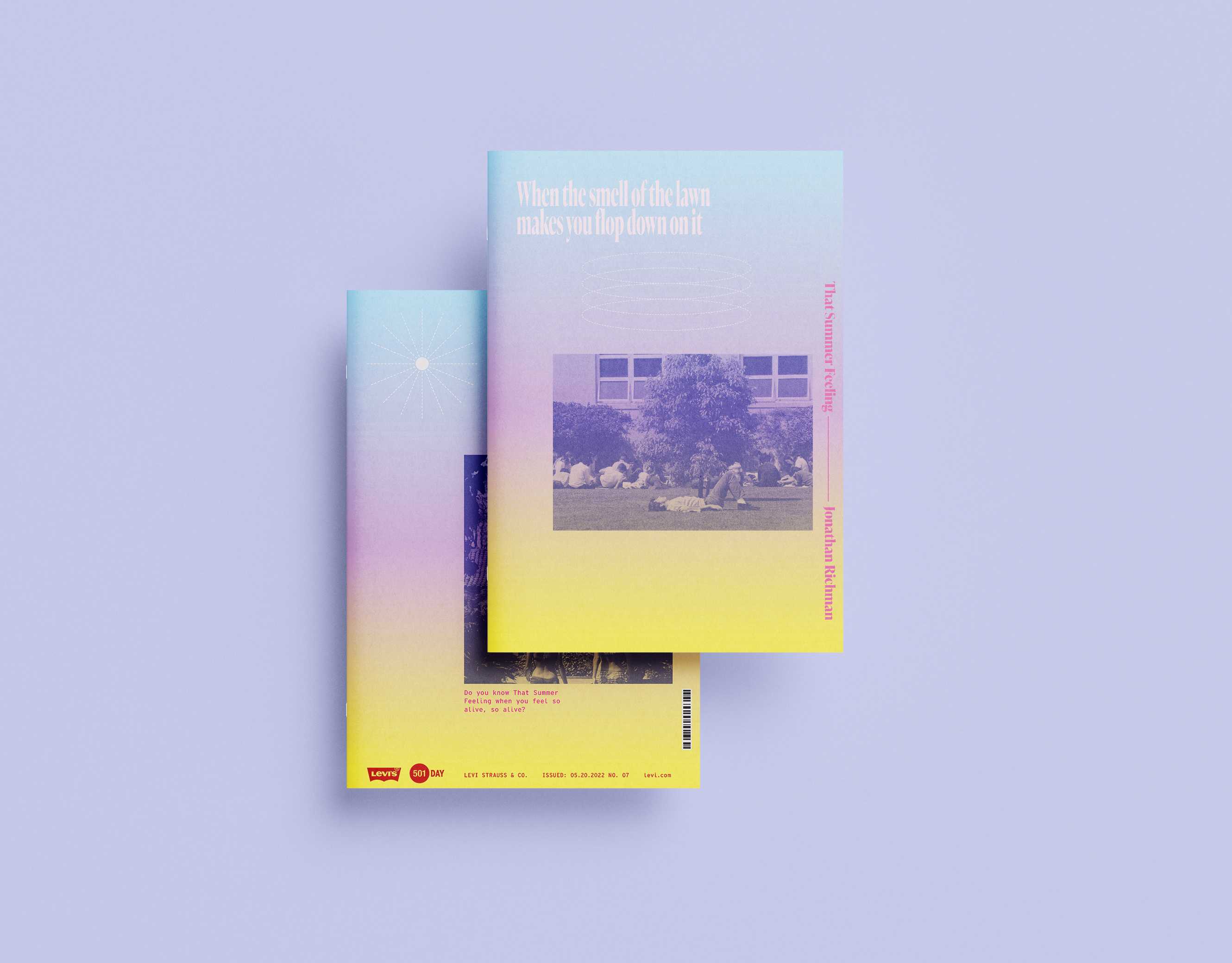
The design solution of this republication communicates Richard Sennett's radical theories of urban planning of the late 1960s early 1970s. The design acknowledges its era but fits within the current handmade aesthetic in visual communication. The concept illustrates Sennett's urban design theories that speak of the shifting cityscape and the need to develop difference and fluidity instead of reliance on the often imposed homogenous modernism, which Sennett claimed was stifling the potential of modern cities.
These ideas are relevant to urban planning debates today as when the book was first published in 1970.
The graphic forms are based on an abstracted section of a city street plan. In this case, to suggest the organic and complex city that Sennett champions were paths, boundaries, districts, nodes, and landmarks combine to create the identity of place and help facilitate individual relationships to urban landscapes.
The typeface is a humanist sans serif, which appears more organic by using random placement. The book's text pages use a text weight of the cover typeface and pairs with a classic serif style which is set ragged right to reflect Sennett's ideas of urban complexity where order and chaos can coexist.
The design can be used in different ways to reveal more of the abstracted city plan to suggest exploration as part of discovering places.
OOH advertising with graphic variation
