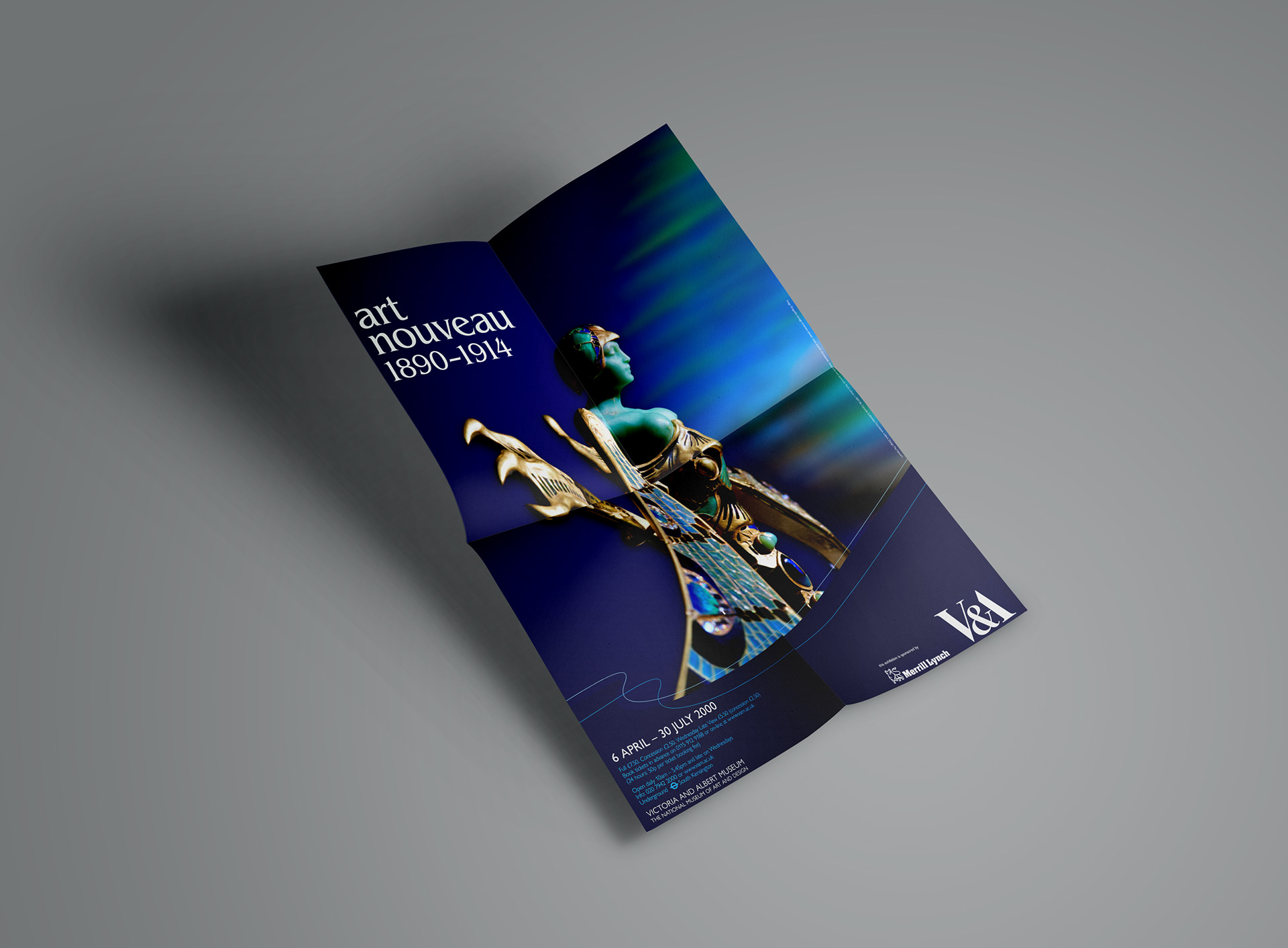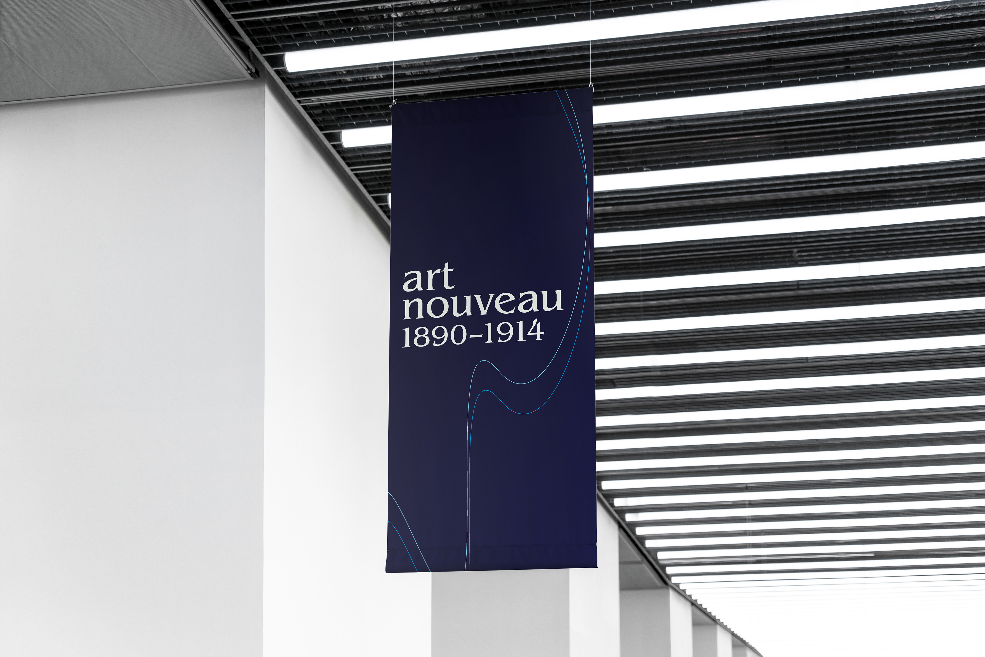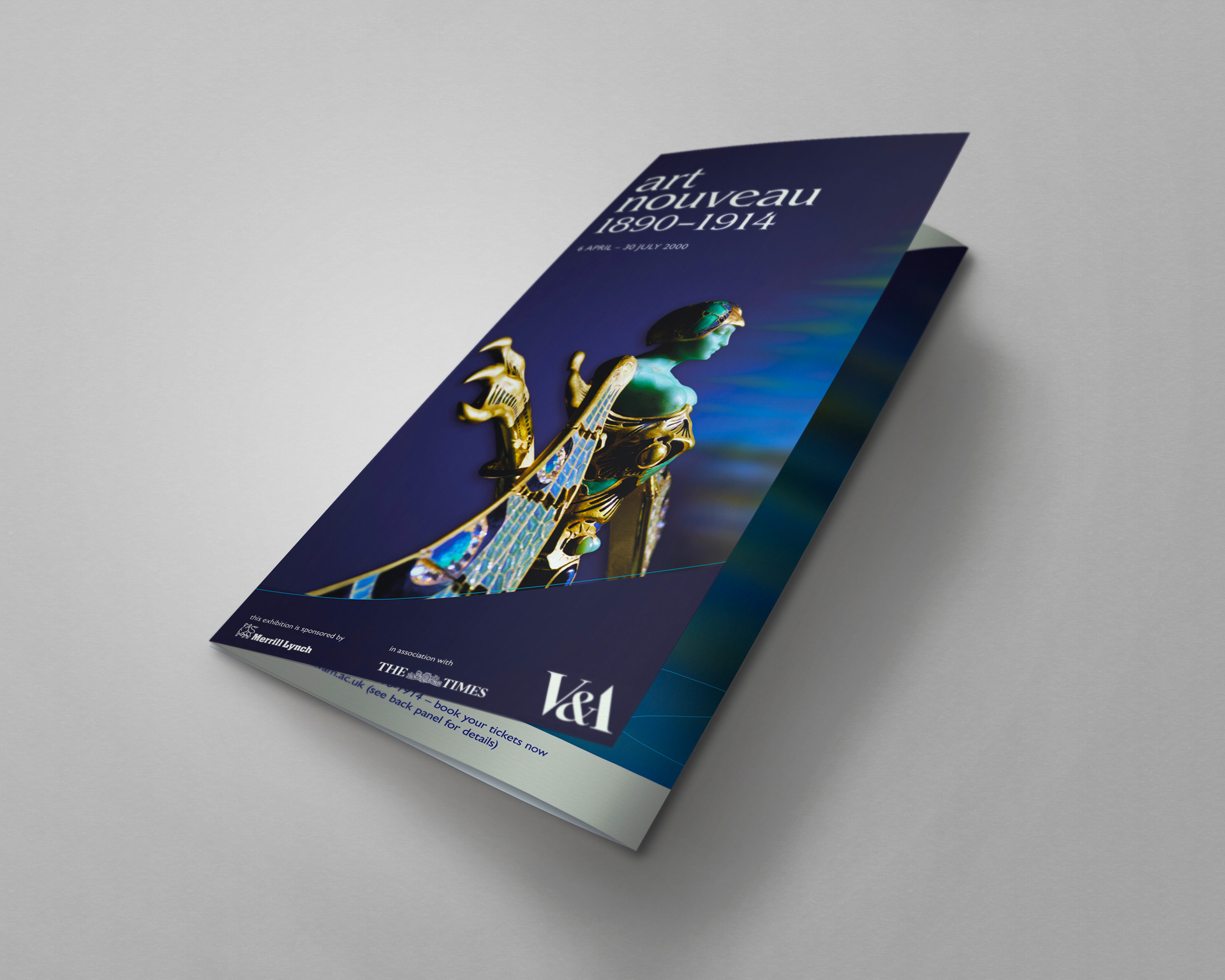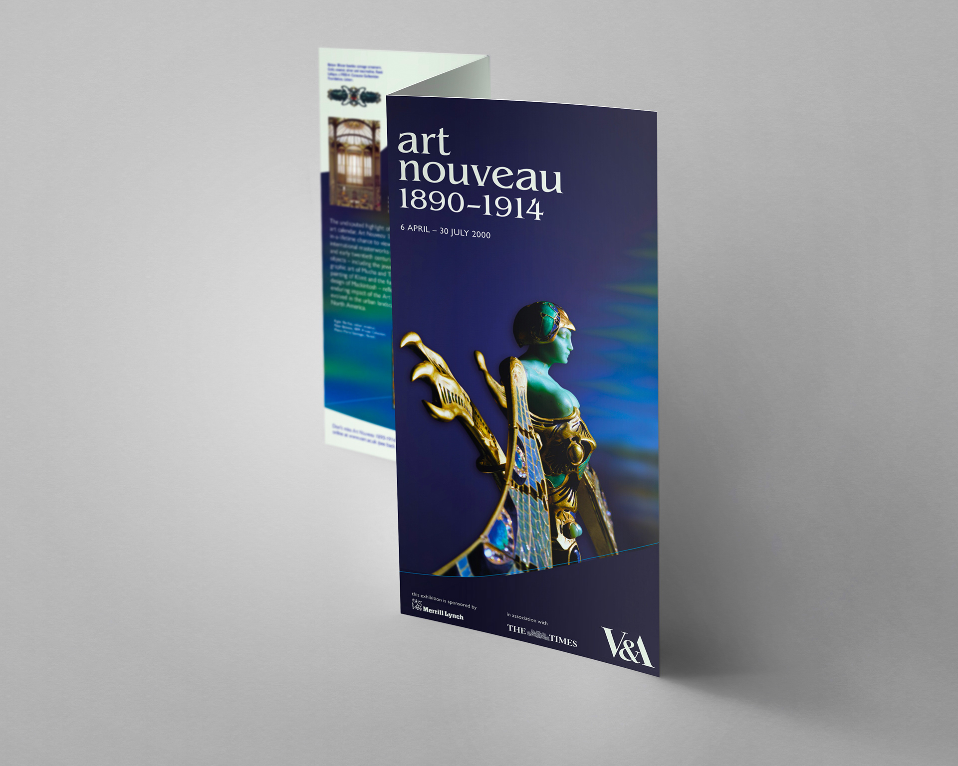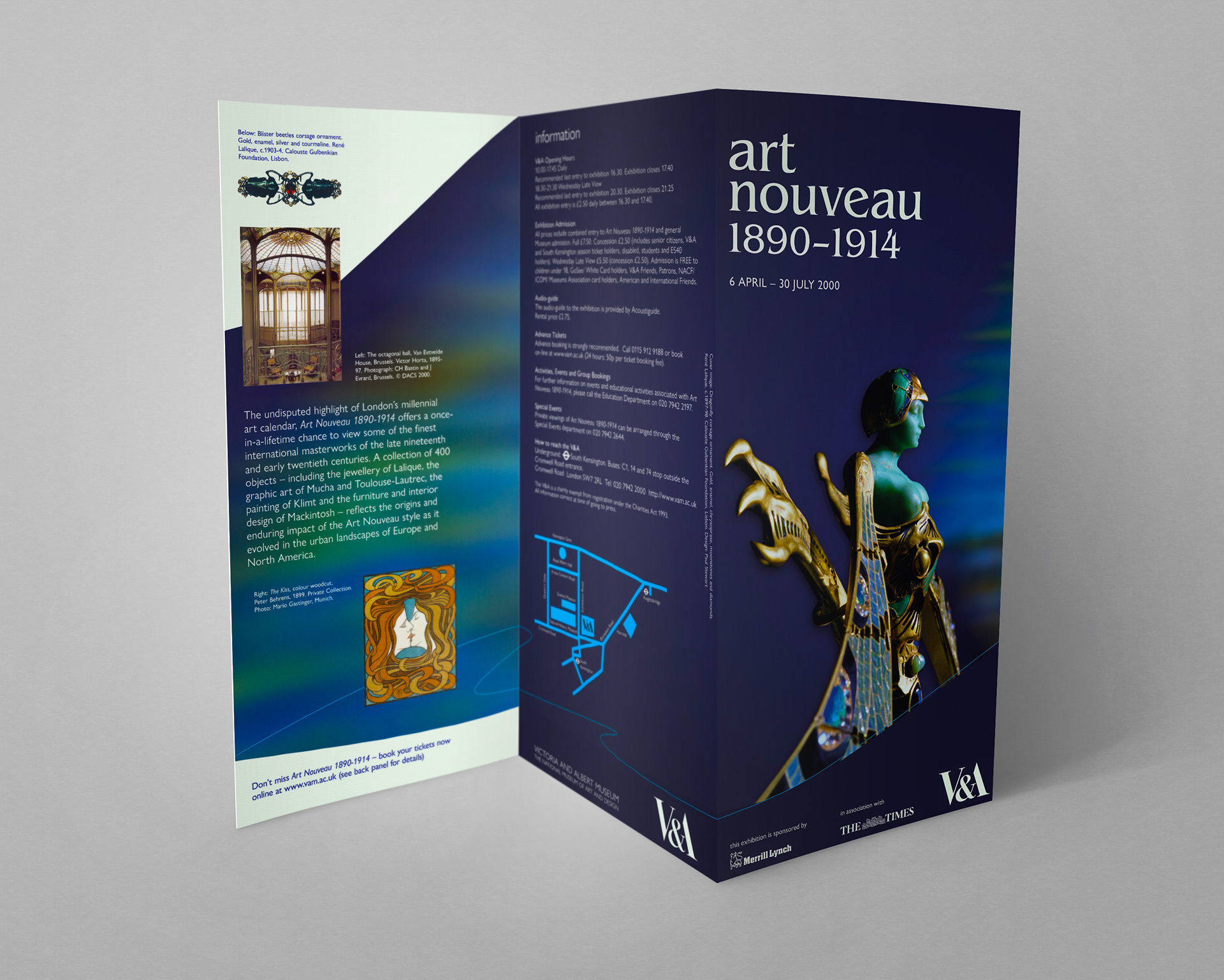
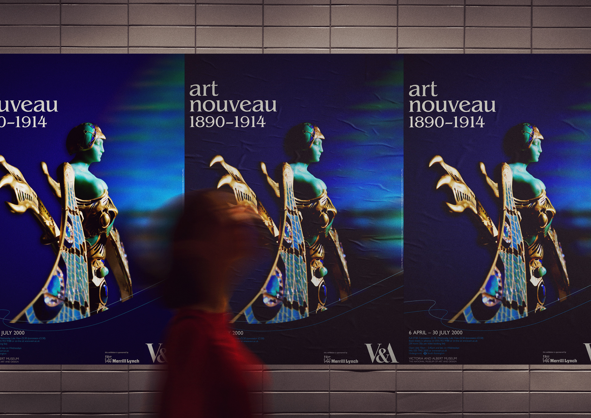
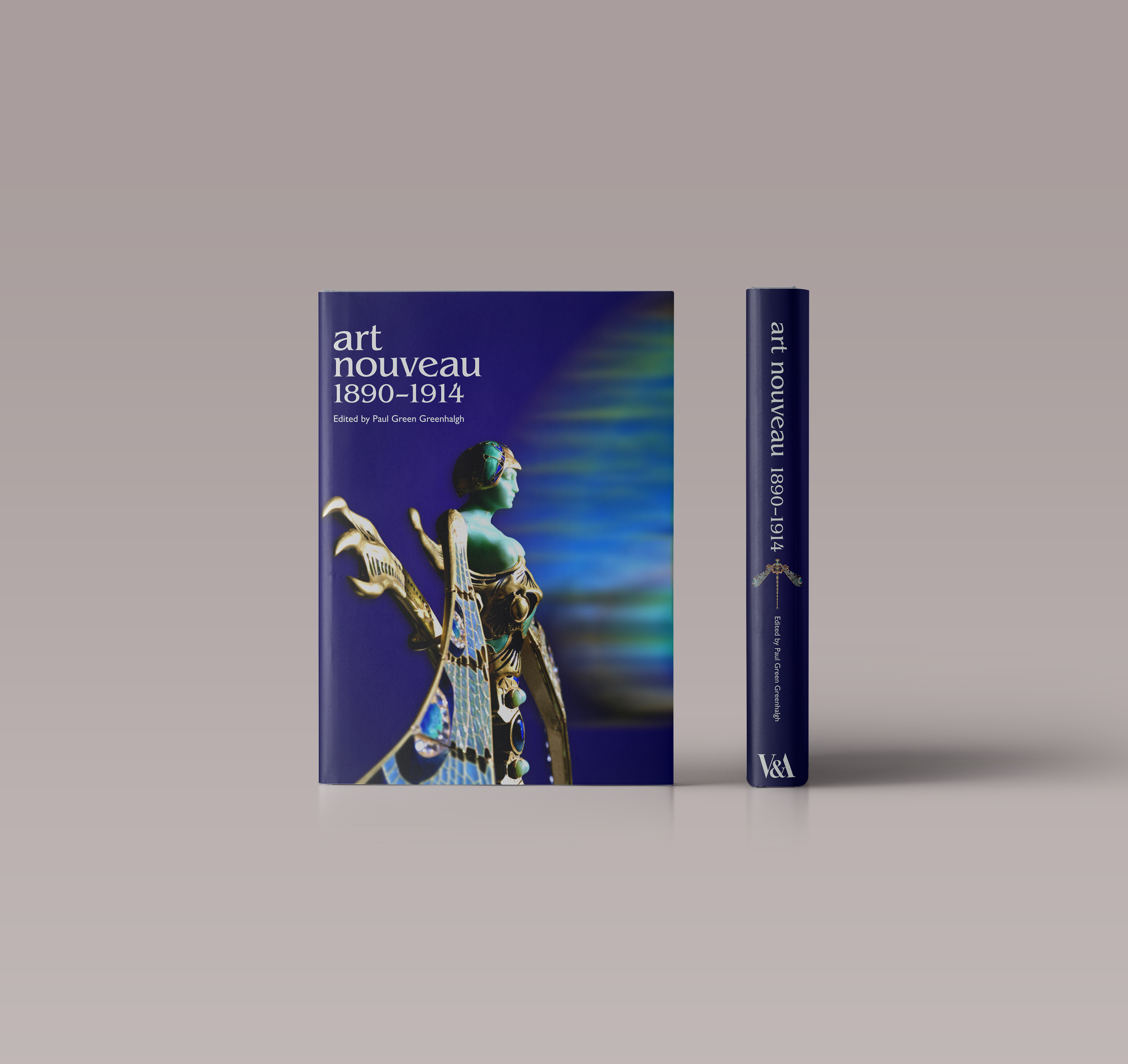
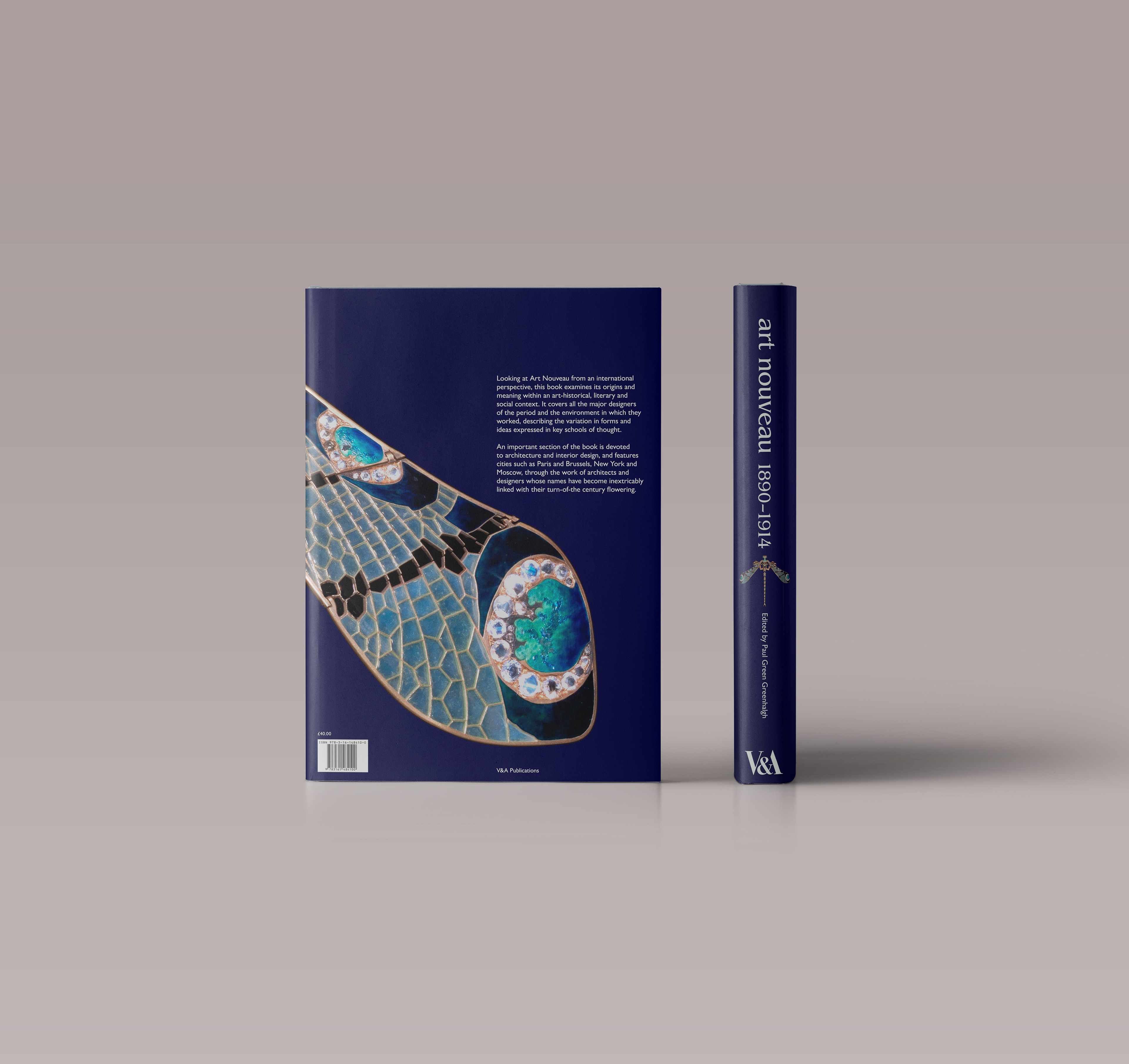
The brief was to design an identity for a major V&A exhibition entitled Art Nouveau 1890-1914. The visual language had to reflect Art Nouveau's aesthetic and the exhibition's content and academic aims and provide a distinctive design language to appeal to a broad range of potential visitors.
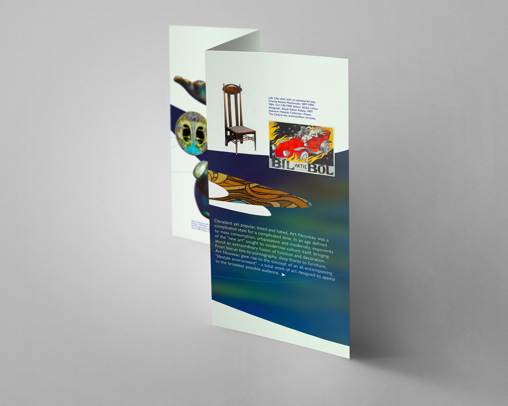
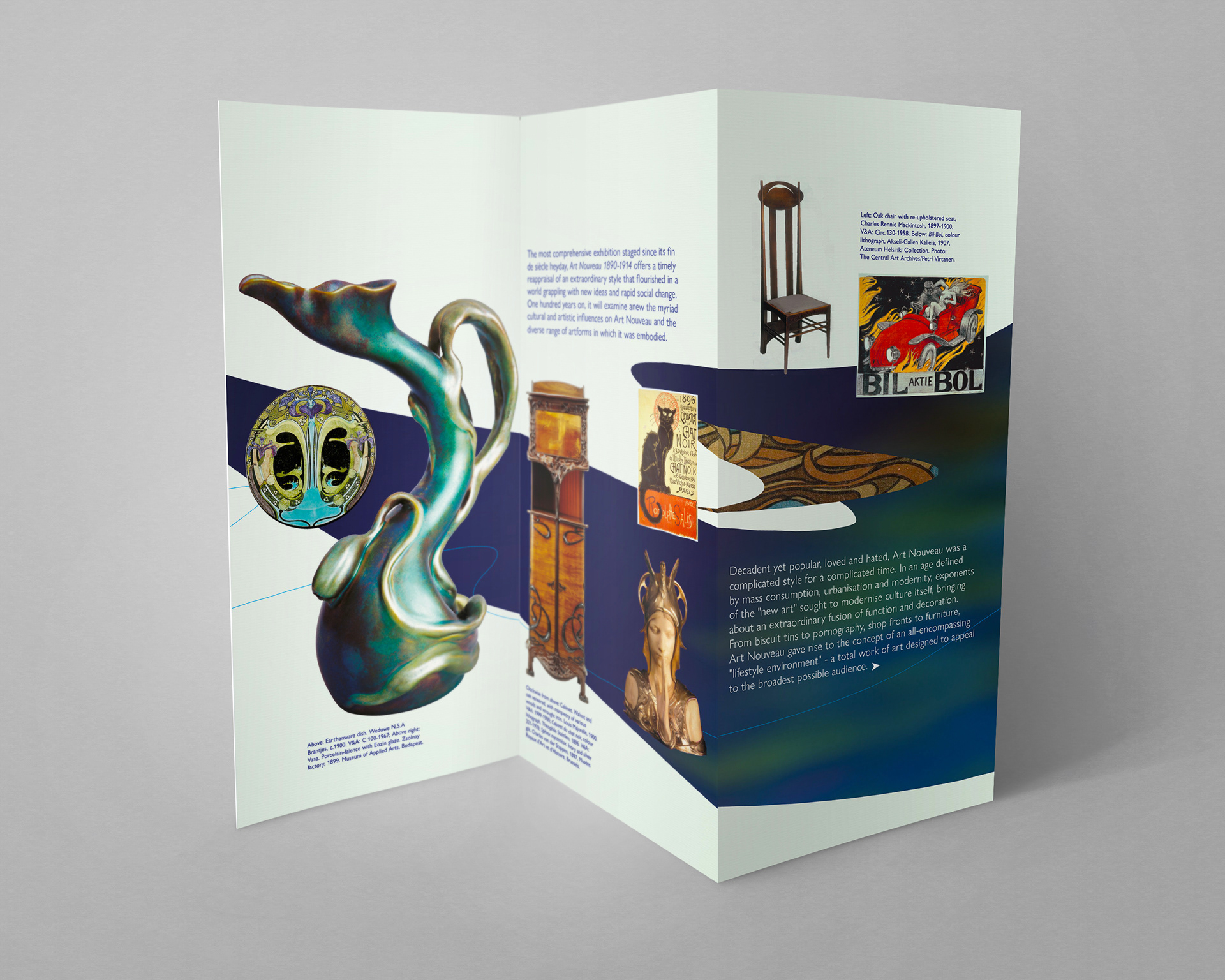
Among those featured in the exhibition were artists and designers, including Beardsley, Gauguin, Gallé, Gaudi, Mackintosh, Mucha, Munch, Tiffany, and Toulouse-Lautrec.
I devised a design concept based on movement, which is characteristic of Art Nouveau forms combined with the natural and mystical aspects of the movement. The line elements evoke the sensual and curvaceous lines often referred to as the whiplash in Art Nouveau design. The light created by the dragonfly wing in motion creates an atmosphere of divine light illuminating the subject.
The typefaces selected were ITC Benguiat and Gill Sans Nova; Benguiat is based on typefaces of the Art Nouveau period but is not a revivalist style and manages to impart an organic and characterful aesthetic to the visual language yet has a crispness that provides a timeless presentation of the Art Nouveau epoch. I selected Gill Sans for its legibility for information and text usages. Being a humanist sans-serif typeface, it contrasts to the more decorative aspects of Benguiat while still presenting natural type forms.
Original presentation version
Original presentation version