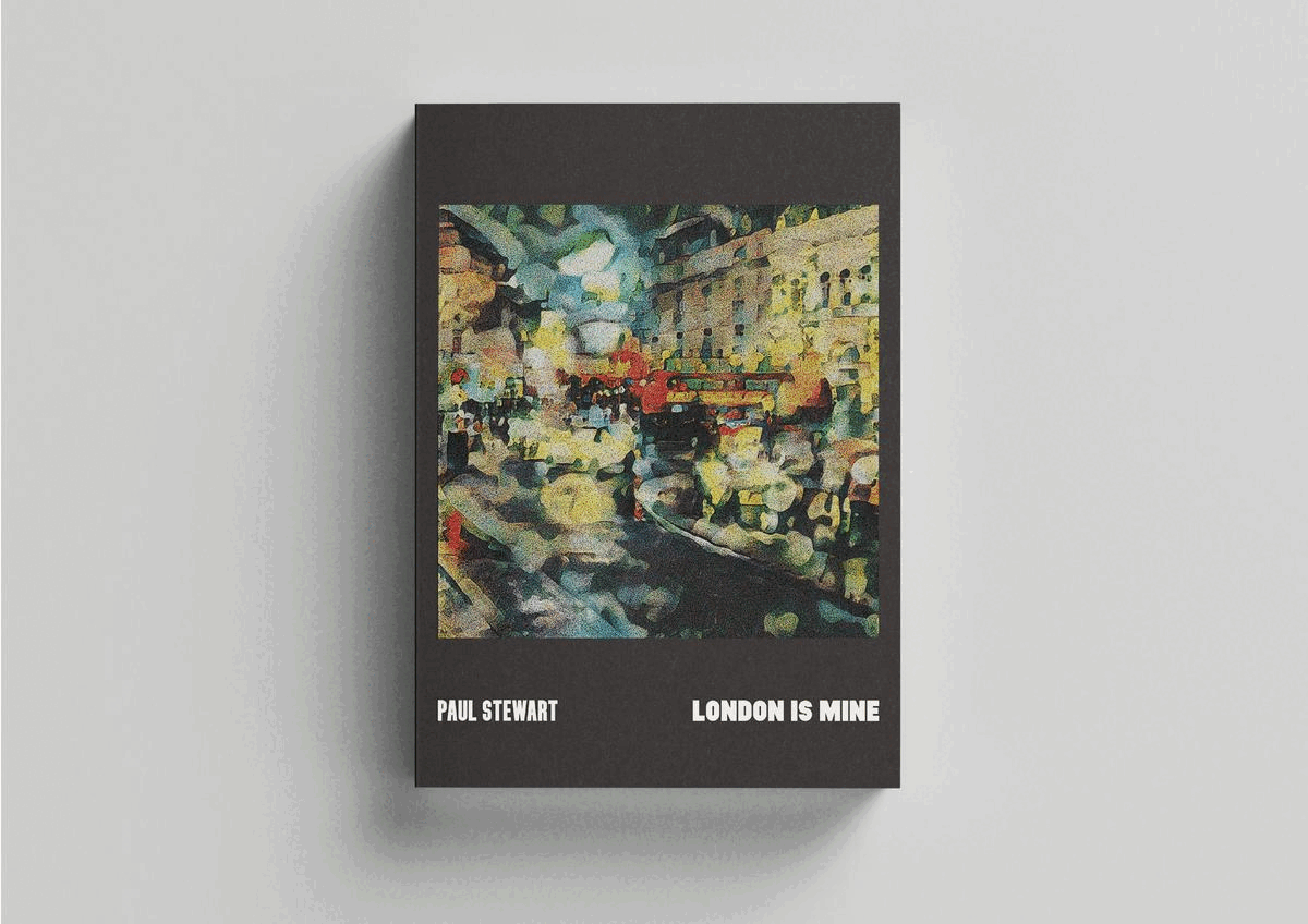
Design, texts, and images by Paul Stewart.
This project combines my key creative interests, typography, image making and urbanism, into a book project that is part artist's monograph, action research experiment, and London memoir. Weaved together, this narrative form leans into my research interests around the relationship between personal identity and the city.
The project examines place identity, placemaking and place attachment themes. Using experimental visual and textual concepts to extrapolate and distil the essence and meaning of what cities are and can be, the work connects the lived experience with a set of research methods and creative explorations that help delve into the elusive qualities of my home city London.
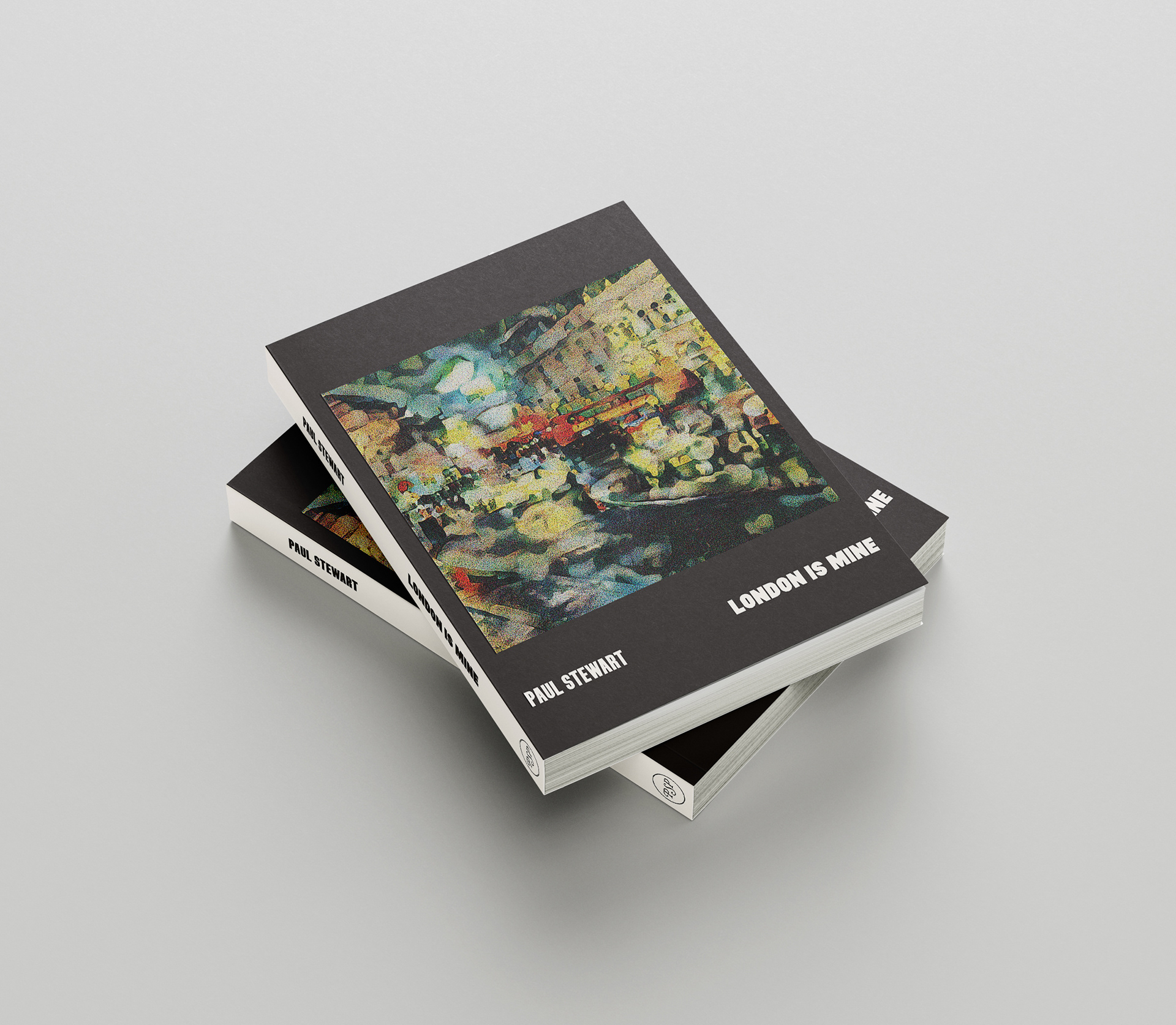
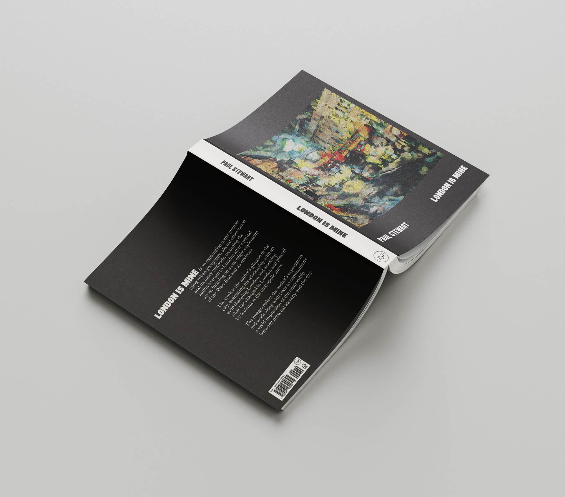
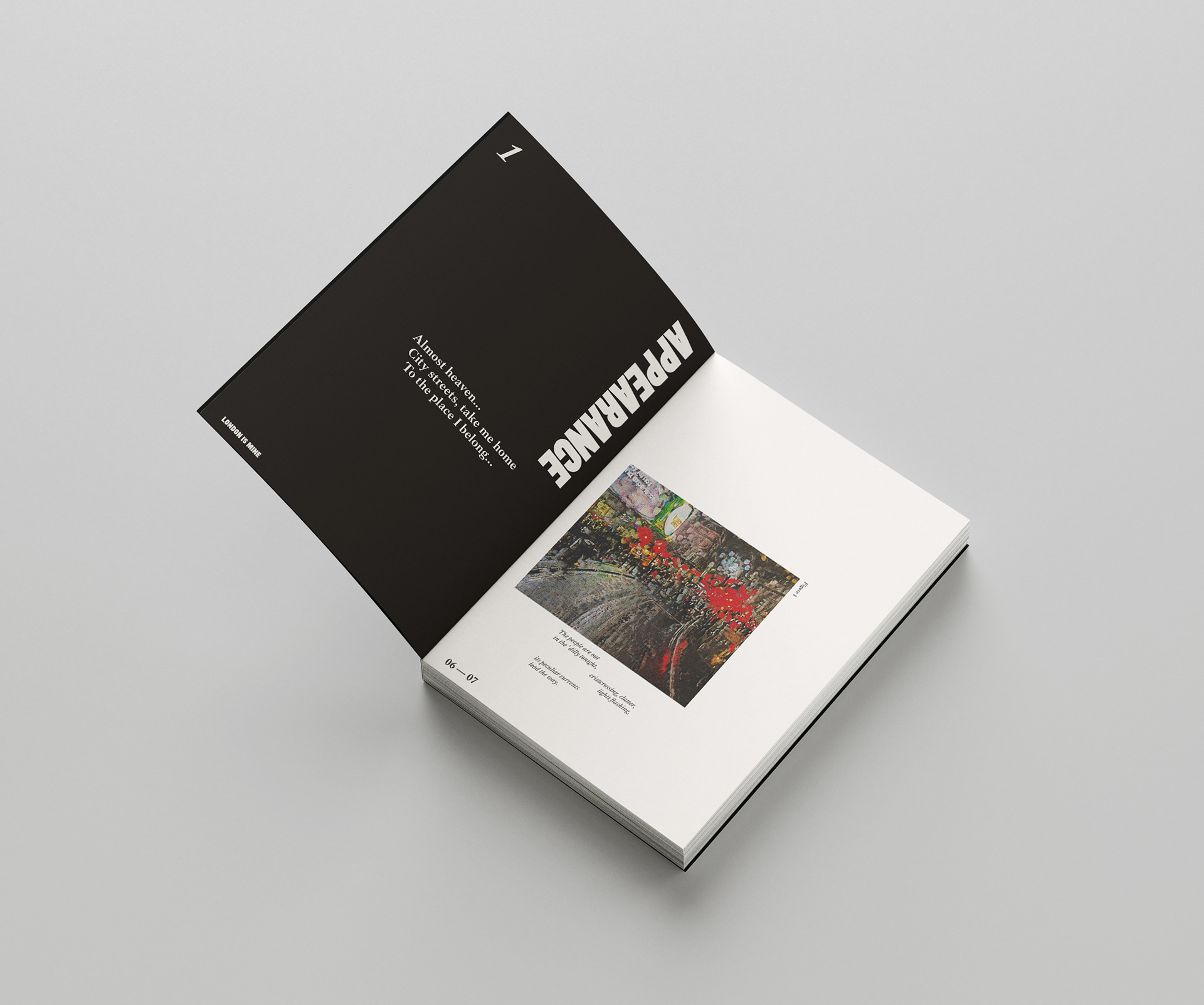
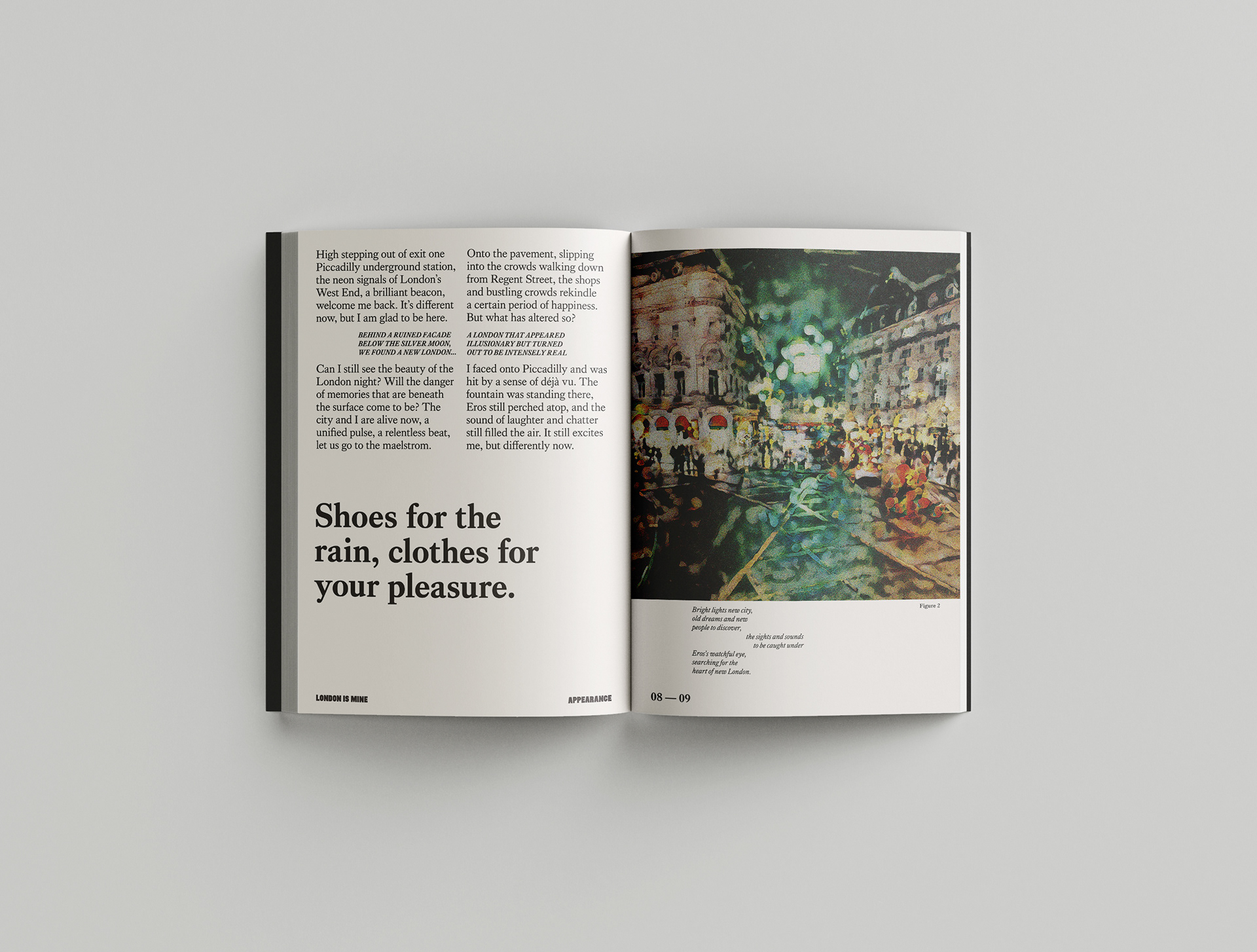
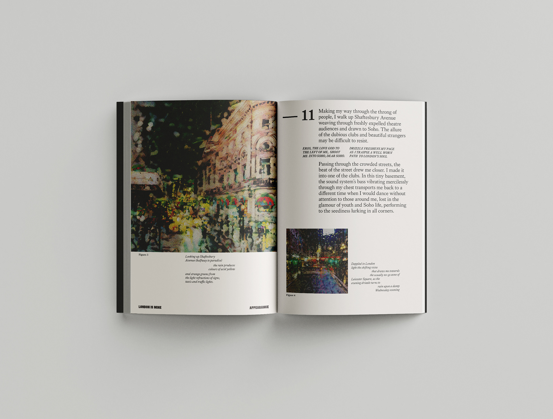
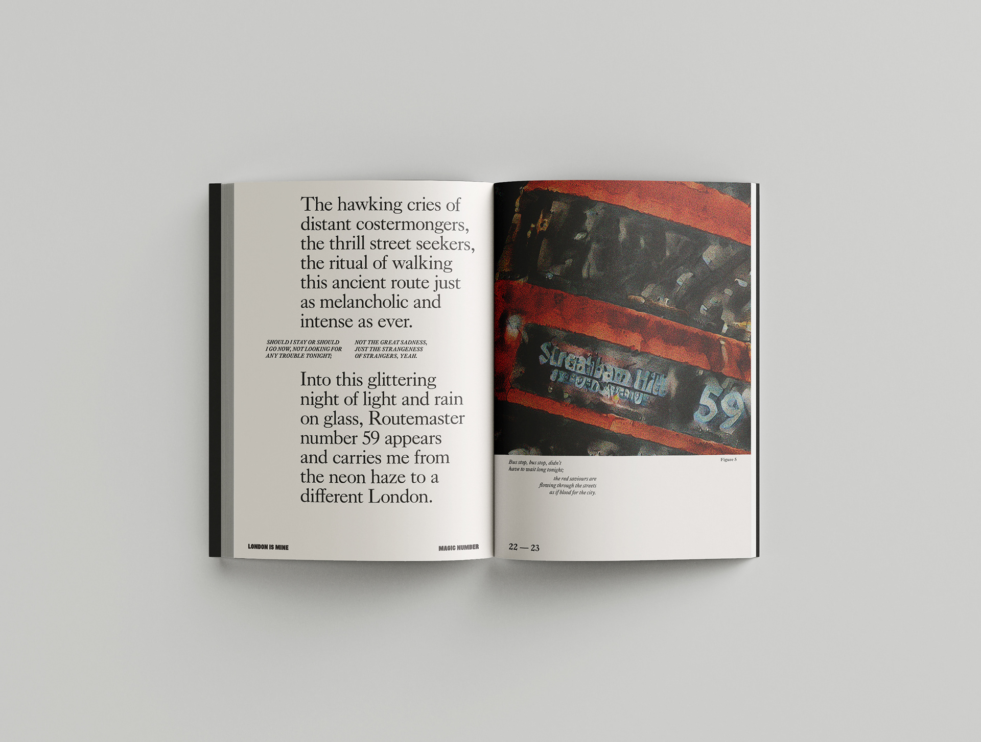
The publication is a visual and written exploration using urban geography, altered observation and memory methods, recording a return to London after a prolonged hiatus and focuses on one solo mid-week evening exploration of the West End and its environs.
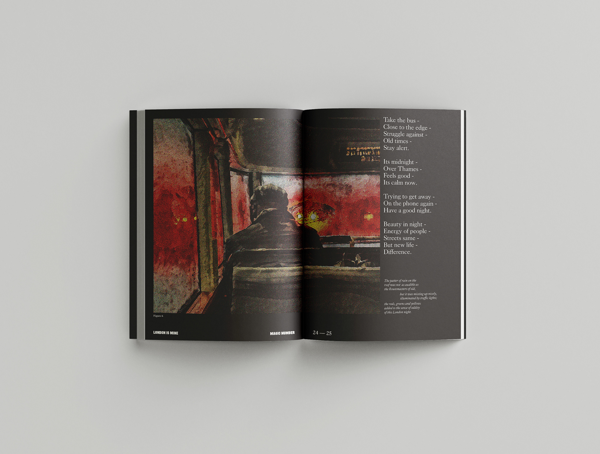
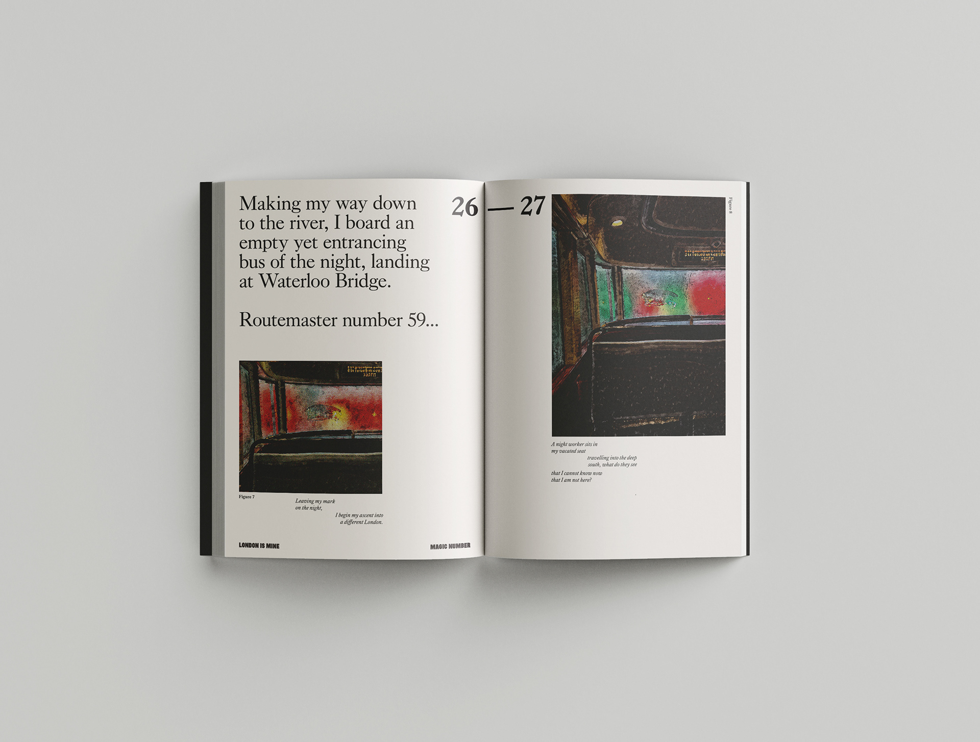
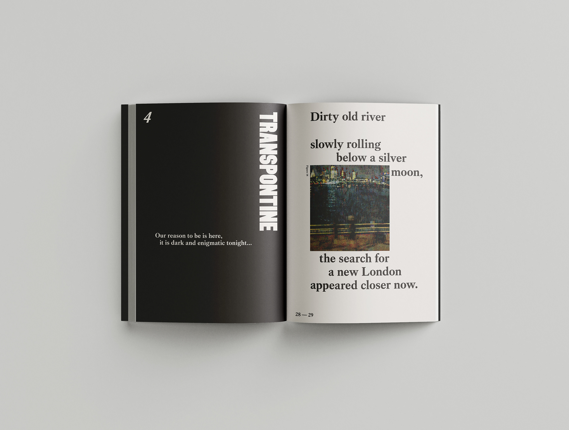
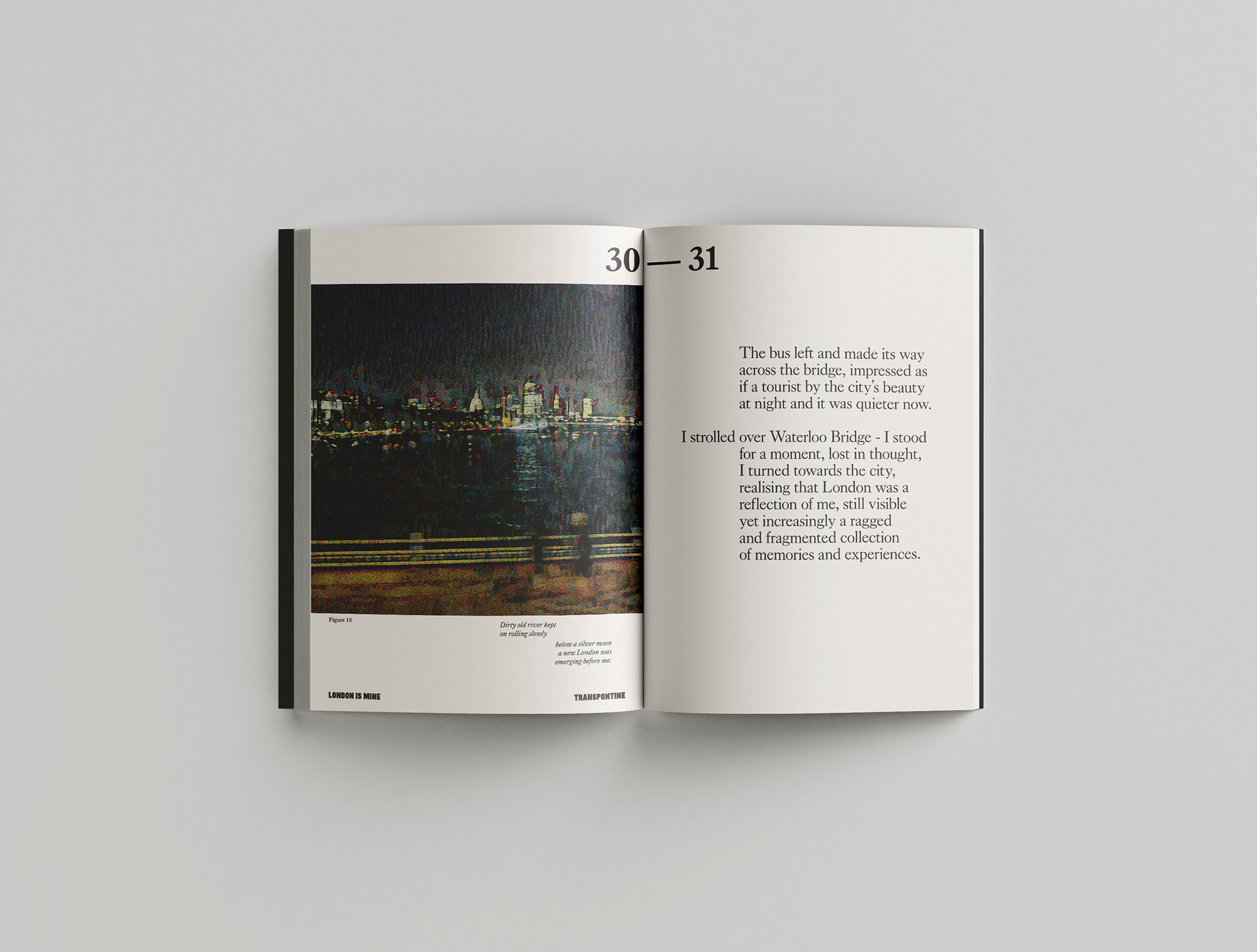
The paintings reflect the experiences and work along with texts to communicate a vivid impression of the relationship between personal identity and city life.
The paintings reflect the experiences and work along with texts to communicate a vivid impression of the relationship between personal identity and city life.
The two typefaces selected both have London connections. Firstly, LDN Mammoth Woodblock by London Type is a typestyle inspired by and designed in London and evokes the woodblock types used on large pasted-up playbill posters seen in London from the 1800s onwards. The font's boldness emphasises the immensity and character of London.
Secondly, Caslon originating in the mid-eighteenth century, is often considered the English typeface, and its legibility in text setting means it is commonly used in book design; the typeface family was created in London and lends a timeless aesthetic to the design language. I have used a contemporary revival of Caslon, The King's Caslon by Dalton Maag, as it provides a modern crispness yet retains the original character of the designs.
Using these particular styles creates a tone of voice that is both street and bookish and reflects the juxtaposition of London in its urban form, where old and new buildings are placed in an apparently arbitrary manner and in the way different people are drawn to the city and are often living 'cheek by jowl'; these are what provides London with its place identity and distinct character and atmosphere.
Therefore I hoped the publication would reveal these London concepts through texts and images that communicate elegance, joy and excitement, but also the undercurrents of strangeness, desolation, and alienation that one may feel in themselves in the city and acknowledge the multiplexity of social and psychological relationships one may have in and to London.
Specification
Finished size
A4 Portrait
A4 Portrait
Cover paper stock
330gsm G . F Smith Naturalis
Matt Absolute White
Inner paper stock
135gsm G . F Smith Naturalis
Matt Absolute White
Offset printed
CMYK
Perfect bound
Initial print run 500 copies print run 500 copies
Perfect bound
Initial print run 500 copies print run 500 copies